Package Exports
- vue-screen
This package does not declare an exports field, so the exports above have been automatically detected and optimized by JSPM instead. If any package subpath is missing, it is recommended to post an issue to the original package (vue-screen) to support the "exports" field. If that is not possible, create a JSPM override to customize the exports field for this package.
Readme

VueScreen
Reactive window size and media query states for VueJS. Supports your favourite UI framework grid breakpoints out of the box, and can be configured with any custom breakpoints.
Features
✔ Reactive and debounced window innerWidth and innerHeight ↔ 🕐
✔ Reactive media query states and device orientation 💻📲
✔ Detect touch screen capability 👆🖱
✔ breakpoints for most common ui frameworks provided out of the box: Tailwind, Bootstrap, Bulma, Foundation, Materialize, Semantic UI ⚙ 📦
✔ SSR compatible 🚀 📟 (Nuxt module and Gridsome plugin coming 🔜)
Requirements
As the library uses Vue.Observable API internally, Vue 2.6+ is required.
Installation
Embed directly as a script:
<script src="https://unpkg.com/vue-screen/dist/vue-screen.min.js"></script>When embedding, the script automatically registers itself as a Vue plugin.
Via npm:
npm i vue-screenimport Vue from 'vue';
import VueScreen from 'vue-screen';
Vue.use(VueScreen);Configuration
Use default breakpoints from one of the supported UI frameworks:
Tailwind (default)
Vue.use(VueScreen); Vue.use(VueScreen, 'tailwind'); Bootstrap
Vue.use(VueScreen, 'bootstrap'); Bulma
Vue.use(VueScreen, 'bulma'); Foundation
Vue.use(VueScreen, 'foundation'); Materialize
Vue.use(VueScreen, 'materialize'); Semantic UI
Vue.use(VueScreen, 'semantic-ui'); Custom breakpoints:
Vue.use(VueScreen, {
    sm: 480, // will be converted to 480px
    md: '47em',
    lg: '1200px',
});
You can find default UI framework breakpoints here
Callbacks
You can provide custom callbacks that will be run every time the debounced window resize event is triggered:
Vue.use(VueScreen, {
    md: 768,
    lg: 992,
    xl: 1200,
    tablet: screen => screen.md && !screen.xl && screen.touch,
});
To use callbacks together with breakpoints from one of the supported UI frameworks you can specify the extend property:
Vue.use(VueScreen, {
    extend: 'bootstrap',
    tablet: screen => screen.md && !screen.xl && screen.touch,
});
Basic usage
After registering, the property $screen will be injected on the Vue prototype. You can access it in a component using this.$screen.
In a template
<template>
    <div>
        <p>Page width is {{ $screen.width }} px</p>
        <p>Page height is {{ $screen.height }} px</p>
    </div>
</template>
As computed properties
<template>
    <div :class="media">
        <p>VueScreen</p>
    </div>
</template>
<script>
export default {
    computed: {
        media() {
            return {
                'is-phone': this.$screen.sm,
                'is-tablet': this.$screen.md,
                'is-desktop': this.$screen.lg,
                'can-touch': this.$screen.touch,
            };
        }
    }
}
</script>
As watchers
export default {
    watch: {
        '$screen.width'() {
            alert('Width changed');
        }
    }
}
Check out demo source code for more examples.
API
Available properties on the $screen object:
width
Number
Equivalent to window.innerWidth
height
Number
Equivalent to window.innerHeight
touch
Boolean
Tells if touch events are supported
portrait
Boolean
Tells if the device is in portrait mode
landscape
Boolean
Tells if the device is in landscape mode
<breakpoint key>
Boolean
Every breakpoint key specified in the configuration will be available as a boolean value indicating if the corresponding media query matches.
To view default breakpoint keys and values for each framework, click here.
<callback name>
Any
Every callback specified in the configuration will have a corresponding property indicating the result of the callback. Callbacks will be called on every debounced resize event.
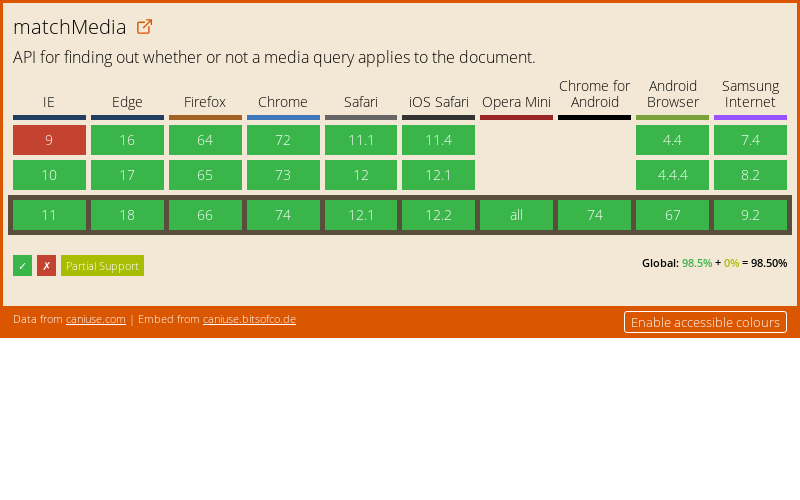
Browser support
All browsers that support matchMedia API