
Package Exports
- vue-stepper
This package does not declare an exports field, so the exports above have been automatically detected and optimized by JSPM instead. If any package subpath is missing, it is recommended to post an issue to the original package (vue-stepper) to support the "exports" field. If that is not possible, create a JSPM override to customize the exports field for this package.
Readme
Stepper
Stepper for Vue.
A simple stepper with simple actions such as next, back and finish to perform simple forms.
Installation
npm install vue-stepper --saveProperties
| Properties | Type | Values |
|---|---|---|
steps |
Array of Objects | Each object is a step that will be included in the stepper |
locale |
String | Default: en. Current options: en, es. |
top-buttons |
Boolean | Default: false. If true buttons on the header, at the start and the end of the steps, will be shown for better user experience. |
keep-alive |
Boolean | Default: true. If true step components won't be destroy in each step change, bue if false they will. |
Steps object properties
| Properties | Type | Values |
|---|---|---|
icon |
String | Ex.: mail. Name of icons that belong to material-icons library |
name |
String | Name of the step. Each step name MUST be unique |
title |
String | Title that will be displayed below the step, on bold. |
subtitle |
String | Subtitle displayed below the title. |
component |
Component | Imported component that will be show on the content area of the step. |
completed |
Boolean | If step is completed or not. If TRUE a done material icon will replace the one given before. Only mark as completed when you want to let know the user that the previous step has been completed |
Events emitted by stepper
| Event name | When |
|---|---|
completed-step |
Triggered when a step is completed. Completed meaning that current step has been left behind on the step list. Now you can mark your step object as completed if you desire it. |
active-step |
Current active step. It's name and index are exposed on the deployed payload. |
stepper-finished |
Event emitted when the user clicks the final button. Now it's time to execute a final callback method |
clicking-back |
Triggered when user clicks the back button to return to a previous step |
Events that can be emitted by content component
| Event name | When |
|---|---|
can-continue |
By default the next button will be disabled until the event can-continue is triggered with an object containing the property value. Value accepts a boolean, if true next/finish button will be enabled if false disabled. |
Examples
Template example
<section class="section">
    <div class="container">
        <div class="columns">
            <div class="column is-8 is-offset-2">
                <horizontal-stepper :steps="demoSteps" @completed-step="completeStep"
                                    @active-step="isStepActive" @stepper-finished="alert"
                >
                </horizontal-stepper>
            </div>
        </div>
    </div>
</section>
Script example
import HorizontalStepper from 'vue-stepper';
// This components will have the content for each stepper step.
import StepOne from './StepOne.vue';
import StepTwo from './StepTwo.vue';
export default {
components: {
HorizontalStepper
},
data(){
return {
demoSteps: [
{
icon: 'mail',
name: 'first',
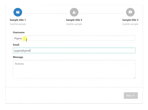
title: 'Sample title 1',
subtitle: 'Subtitle sample',
component: StepOne,
completed: false
},
{
icon: 'report_problem',
name: 'second',
title: 'Sample title 2',
subtitle: 'Subtitle sample',
component: StepTwo,
completed: false
}
]
}
},
methods: {
// Executed when @completed-step event is triggered
completeStep(payload) {
this.demoSteps.forEach((step) => {
if (step.name === payload.name) {
step.completed = true;
}
})
},
// Executed when @active-step event is triggered
isStepActive(payload) {
this.demoSteps.forEach((step) => {
if (step.name === payload.name) {
if(step.completed === true) {
step.completed = false;
}
}
})
},
// Executed when @stepper-finished event is triggered
alert(payload) {
alert('end')
}
}
}
Example of component content that will be displayed on the first step (vuelidate used to validate form).
Template
    <div style="padding: 2rem 3rem; text-align: left;">
        <div class="field">
            <label class="label">Username</label>
            <div class="control">
                <input :class="['input', ($v.form.username.$error) ? 'is-danger' : '']" type="text" placeholder="Text input"
                       v-model="form.username">
            </div>
            <p v-if="$v.form.username.$error" class="help is-danger">This username is invalid</p>
        </div>
        <div class="field">
            <label class="label">Email</label>
            <div class="control">
                <input :class="['input', ($v.form.demoEmail.$error) ? 'is-danger' : '']"  type="text" placeholder="Email input" v-model="form.demoEmail">
            </div>
            <p v-if="$v.form.demoEmail.$error" class="help is-danger">This email is invalid</p>
        </div>
        <div class="field">
            <label class="label">Message</label>
            <div class="control">
                <textarea :class="['textarea', ($v.form.message.$error) ? 'is-danger' : '']"  placeholder="Textarea" v-model="form.message"></textarea>
            </div>
        </div>
    </div>
Javascript
    import {validationMixin} from 'vuelidate'
    import {required, email} from 'vuelidate/lib/validators'

    export default {
        props: ['clickedNext'],
        mixins: [validationMixin],
        data() {
            return {
                form: {
                    username: '',
                    demoEmail: '',
                    message: ''
                }
            }
        },
        validations: {
            form: {
                username: {
                    required
                },
                demoEmail: {
                    required,
                    email
                },
                message: {
                    required
                }
            }
        },
        watch: {
            $v: {
                handler: function (val) {
                    if(!val.$invalid) {
                        this.$emit('can-continue', {value: true});
                    } else {
                        this.$emit('can-continue', {value: false});
                    }
                },
                deep: true
            },
            clickedNext(val) {
                if(val === true) {
                    this.$v.form.$touch();
                }
            }
        },
        mounted() {
            if(!this.$v.$invalid) {
                this.$emit('can-continue', {value: true});
            } else {
                this.$emit('can-continue', {value: false});
            }
        }
    }