
Package Exports
- vue3-cute-component
- vue3-cute-component/dist/vue3-cute-component.es.js
- vue3-cute-component/dist/vue3-cute-component.umd.js
This package does not declare an exports field, so the exports above have been automatically detected and optimized by JSPM instead. If any package subpath is missing, it is recommended to post an issue to the original package (vue3-cute-component) to support the "exports" field. If that is not possible, create a JSPM override to customize the exports field for this package.
Readme
前言
[在线预览]](https://vue3-cute-component.netlify.app/)
- timeline
- button
Env
vue >= @v3
Install
pnpm i vue3-cute-component or npm i vue3-cute-component or yarn add vue3-cute-componentUsage
局部引入
main.ts
import 'vue3-cute-component/dist/style.css'<script lang="ts" setup>
import { Timeline, TimelineTitle, TimelineItem } from 'vue3-cute-component'
</script>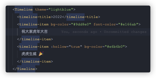
全局引入
main.ts
import { plugin } from 'vue3-cute-component'
import 'vue3-cute-component/dist/style.css'
const app = createApp(App)
app.use(plugin)
Timeline
翻遍github没有找到 vue3 可以使用的 timeline 组件,只找到了一个vue2的
但是看原作者(luyilin)没有升级vue3的计划,我就自己升级了一下,感谢luyilin大佬
API
<timeline> props
使用连字符的属性比使用驼峰大小写的属性更好。The discussion 解释了原因。
theme时间轴组件的主题颜色,设置线和圆的颜色
Type: string Default: #dbdde0background设置空圆和其他时间轴符号的默认背景颜色
Type: string
Default: #dbdde0
<timeline-item> / <timeline-title> props
bg-color设置圆和圆的边框颜色
Type: string Default: #dbdde0line-color只设置圆的边框颜色
Type: string Default: #dbdde0hollow控制圆是否是空心的。
注意:不能与bg-color一起使用,除非您希望更改空背景色
Type: boolean Default: falsefont-color设置时间轴文字或者标题文字颜色。
或者可以用className自行设置,因为内部本身是插槽
Type: string Default: #37414aicon-size设置圆形图标大小
slots="others".Type: string ('small'| 'medium'|'large') Default: ''
Slots
othersDon't like the circle? You can set it to a image, iconfont or anything you want.
<timeline-item>
  <template #others>
    <img
      src="https://user-images.githubusercontent.com/12069729/36057805-80cfc3d2-0e4e-11e8-8851-6fda091ff389.png"
      class="icon-heart"
  />
  </template>
</timeline-item>
Button
全局引入同上
局部引入
main.ts
import 'vue3-cute-component/dist/style.css'<script lang="ts" setup>
import { GdButton } from 'vue3-cute-component'
</script>text按钮文字
Type: string Default: 按钮icon按钮左边的小图标,必须是一个类似这样的字体 这里提供几个:✪ ✆ ✰ ✿ ✍ ☺ ✪ ✔
Type: string Default: ✿color按钮整体颜色,有物种颜色供你选择
- blue
- pink
- glass
- orange
- gray
Type: string Default: bluefontSize按钮文字大小
Type: string Default: 16pxpadding按钮padding
Type: string Default: .5em 1.2em .4em 1.2empadding按钮padding
Type: string Default: .5em 1.2em .4em 1.2emtype按钮类型
- bracket
- arc
- flat
Type: string Default: bracketonly-icon是否只能有图标
Type: boolean
Default: false
License
MIT © xiaojieajie
漆黑之牙 · GitHub @xiaojieajie