
Package Exports
- web-dialog
This package does not declare an exports field, so the exports above have been automatically detected and optimized by JSPM instead. If any package subpath is missing, it is recommended to post an issue to the original package (web-dialog) to support the "exports" field. If that is not possible, create a JSPM override to customize the exports field for this package.
Readme
web-dialog
A highly accessible, customizable and lightweight dialog. Try the dialog yourself at Codepen. Go here to see a demo https://appnest-demo.firebaseapp.com/web-dialog/.
Building a good dialog is hard - there are many things you might not think about if you try to build one. This dialog has been build using the WAI-ARIA Authoring Practices and follows all of the best practices. This makes the dialog:
- Accessible - The dialog is accessible. When opening the dialog, the focus is trapped inside the dialog and outside scrolling is blocked. When the dialog is closed, the focus is restored to what it was before opening it. It is also possible to close the dialog pressing the escape key.
- Works well with Shadow DOM - The dialog works very well with Shadow DOM and is therefore super Web Component friendly. Many people don't think about Shadow DOM when they build a dialog - this one has been build with Web Components in mind.
- Incredible lightweight - The footprint of the dialog is around 2500 bytes gzipped.
- Customizable - It is easy to customize the dialog with a few CSS variables or styling the exposed shadow parts.
- Works with all frameworks - It exposes a web component that can be used with your favorite framework.
- Can be nested - The dialogs can spawn on top of each other.

➤ Table of Contents
- ➤ Installation
- ➤ Usage
- ➤ Center the dialog
- ➤ Sticky header and footer
- ➤ Customize
- ➤ Helpers
- ➤ Documentation
- ➤ Contributors
- ➤ License
➤ Installation
It is recommended that you install the library through NPM.
$ npm i web-dialog
➤ Usage
To use this library you first need to get import the library through code somewhere (import "web-dialog";). After you have done this you'll be able to use the web-dialog web component. In-between the opening and closing tags you can add whatever content you'd want to show in the dialog.
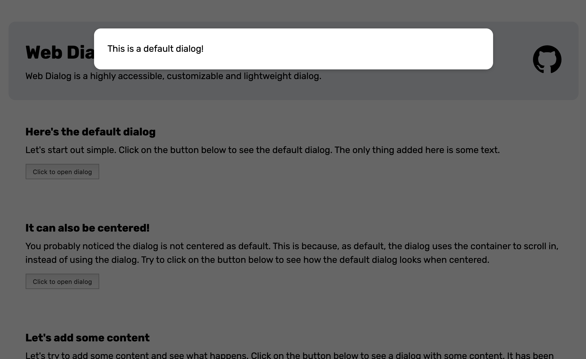
<web-dialog>
  <span>This is a default dialog!</span>
</web-dialog>
To open the dialog you will have to add the open attribute to the element.
<web-dialog open>
  <span>This is a default dialog!</span>
</web-dialog>
Alternatively you can set the .open property of the dialog to true through Javascript.
const $dialog = document.querySelector("web-dialog");
$dialog.open = true;
When the dialog opens it will look like this.
➤ Center the dialog
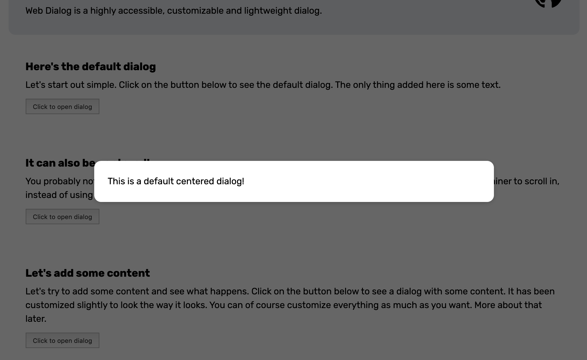
You probably noticed the dialog is not centered as default. This is because, as default, the dialog uses the container around the element to scroll in instead of using the inside of the dialog. To center the dialog you can add the center attribute or set the .center property to true.
<web-dialog center>
  <span>This is a default centered dialog!</span>
</web-dialog>
When opened the dialog will look like this.
➤ Sticky header and footer
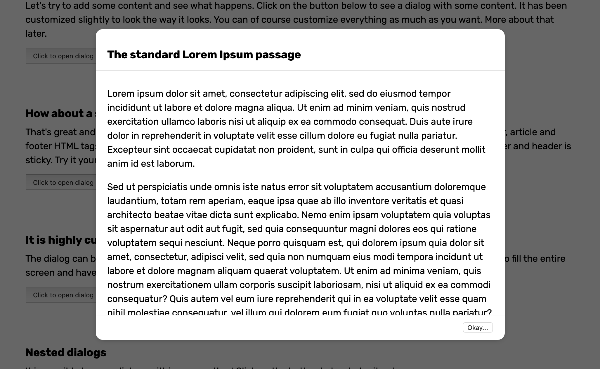
What about a sticky header and footer? No problem at all. Just make sure to use header, article and footer HTML tags for your content and center the dialog. This will style the content in such as way that the footer and header is sticky.
<web-dialog center>
  <header>
    <h3>The standard Lorem Ipsum passage</h3>
  </header>
  <article>
    <p>Lorem ipsum dolor sit amet, consectetur adipiscing...</p>
  </article>
  <footer>
    <button>Okay...</button>
  </footer>
</web-dialog>
To make thing look nice you can add some CSS and apply a bottom border to the header, a top border to the footer and add some padding to the elements. When opened the dialog will look like this.
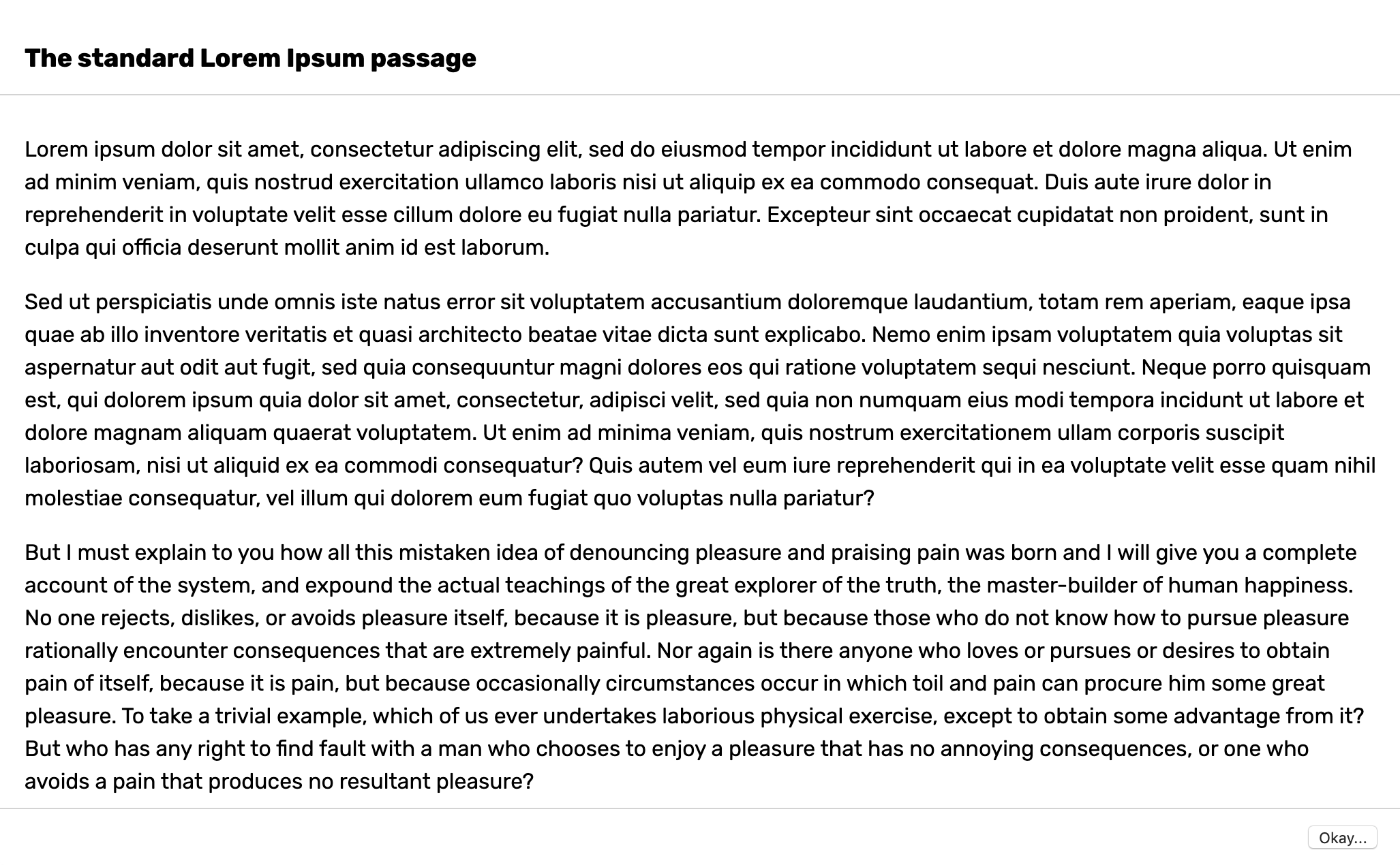
➤ Customize
The dialog can be customized by setting some CSS variables or modifying the shadow parts. You can read about all of the CSS variables you can set and shadow parts you can change here. Let's say you want to create a fullscreen dialog. Then you could change the following CSS variable to achieve it.
web-dialog {
  --dialog-container-padding: 0;
  --dialog-border-radius: 0;
  --dialog-max-width: 100vw;
  --dialog-height: 100%;
  --dialog-animation-duration: 0;
}<web-dialog>
<header>
<h3>The standard Lorem Ipsum passage</h3>
</header>
<article>
<p>Lorem ipsum dolor sit amet, consectetur adipiscing...</p>
</article>
<footer>
<button>Okay...</button>
</footer>
</web-dialog>When opened the dialog will look like this.
➤ Helpers
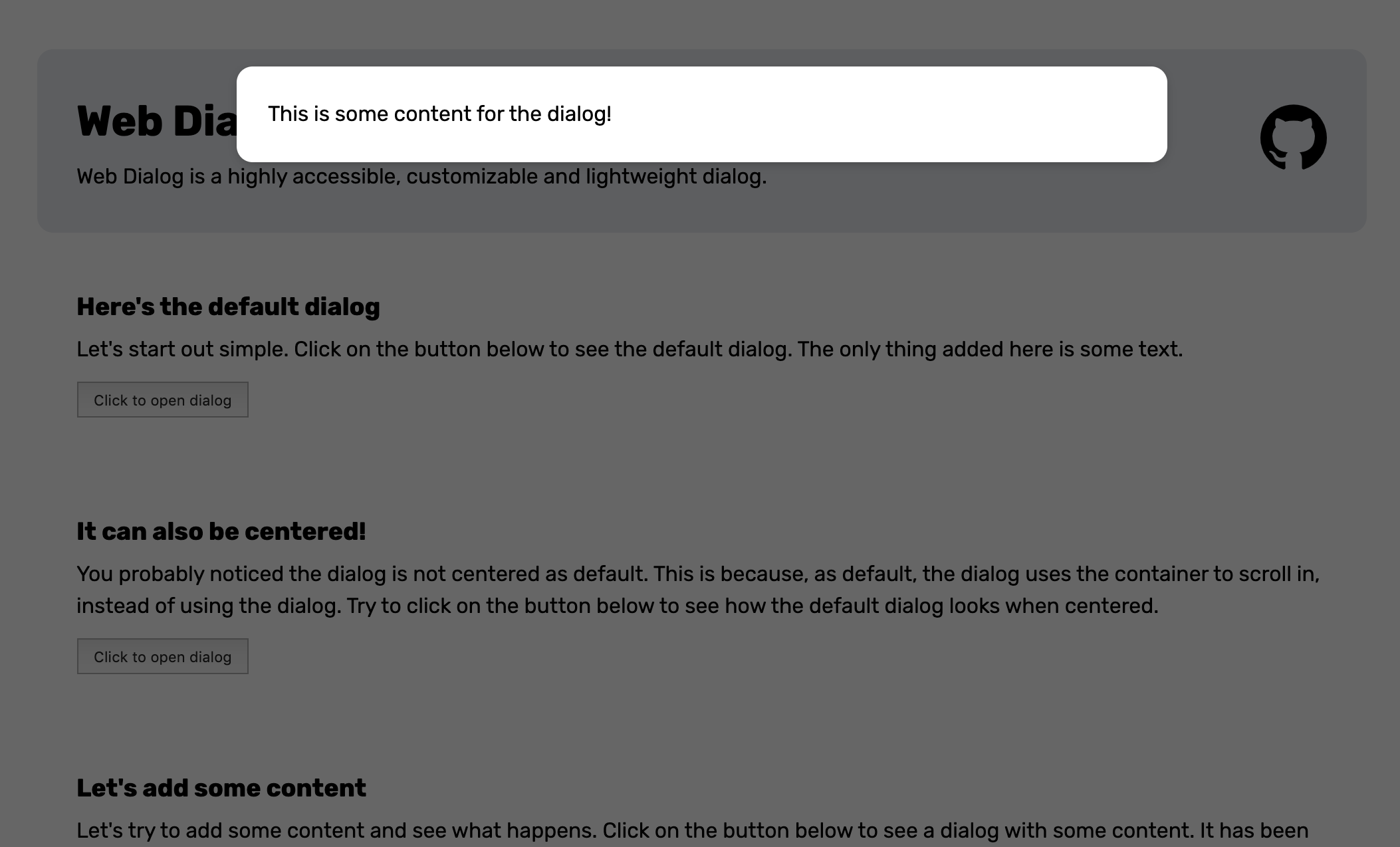
If you want to use the dialog programmatically you can use the openDialog(...) function. This function makes sure to append content inside the dialog, adds it to the DOM and removes it when it closes. You can give the following parameters to the function.
- $template - A DOM element that will be placed inside the dialog as content.
- $container - The container where the dialog will be placed inside. As default this is the
bodyelement. - center - Whether the dialog is centered. As default this is false.
- initialize - Control what instance of WebDialog is created. This is smart if you for example have extended the WebDialog class and want to open that dialog instead.
In it's most simple form you can open a dialog like this:
import {openDialog} from "web-dialog";

const $template = document.createElement("div");
$template.innerText = `This is some content for the dialog!`;

openDialog({$template});
When the openDialog(...) function above is called it will look like this.
➤ Documentation
This section documents the attributes, css variables and slots of the web components this library exposes.
web-dialog
A dialog web component that can be used to display highly interruptive messages.
Properties
| Property | Attribute | Type |
|---|---|---|
center |
center |
boolean |
open |
open |
boolean |
Events
| Event | Description |
|---|---|
close |
This event is fired when the dialog closes. |
closing |
This event is fired before the dialog is closed by clicking escape or on the backdrop. The event is cancellable. |
open |
This event is fired when the dialog opens. |
CSS Custom Properties
| Property | Description |
|---|---|
--dialog-animation-duration |
Duration of the animation duration. |
--dialog-animation-easing |
Easing of the animation. |
--dialog-backdrop-bg |
Background of the backdrop. |
--dialog-border-radius |
Border radius of the dialog. |
--dialog-box-shadow |
Box shadow of the dialog. |
--dialog-container-padding |
Padding of the host container of the dialog. |
--dialog-height |
Height of the dialog. |
--dialog-max-height |
Max height of the dialog. |
--dialog-max-width |
Max width of the dialog. |
--dialog-overflow-x |
Overflow of the x-axis. |
--dialog-overflow-y |
Overflow of the y-axis. |
--dialog-padding |
Padding of the dialog. |
--dialog-width |
Width of the dialog. |
--dialog-z-index |
Z-index of the dialog. |
➤ Contributors
 |
|
|---|---|
| Andreas Mehlsen | You? |
➤ License
Licensed under MIT.