
Package Exports
- @angular-material-extensions/password-strength
This package does not declare an exports field, so the exports above have been automatically detected and optimized by JSPM instead. If any package subpath is missing, it is recommended to post an issue to the original package (@angular-material-extensions/password-strength) to support the "exports" field. If that is not possible, create a JSPM override to customize the exports field for this package.
Readme
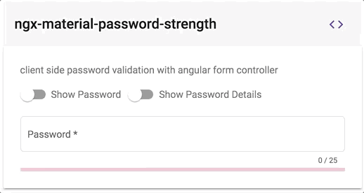
@angular-material-extensions/password-strength - Material password strength meter to indicate how secure is the provided password - Angular v6 supported


This project has been transferred from ngx-material-password-strength to @angular-material-extensions/password-strength
Built by and for developers ❤️
Do you have any question or suggestion ? Please do not hesitate to contact us! Alternatively, provide a PR | open an appropriate issue here
If did you like this project, support angular-material-extensions by starring ⭐ and sharing it 📢
Table of Contents
- Demo
- Components
- Dependencies
- Peer Dependencies
- Additional Requirements - material (Include a theme)
- Additional Requirements - material icons
- Installation
- API
- Usage
- Documentation
- Run Demo App Locally
- Development
- Other Angular Libraries
- Support
- License
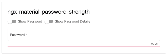
Demo
View all the directives and components in action at https://angular-material-extensions.github.io/password-strength
Library's components
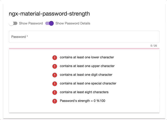
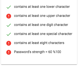
<mat-password-strength>used to calculate and display the strength of a provided password
- strength score less than 20%
- strength score less than 40%
- strength score less than 100%
<mat-password-strength-info>used to display more information about the strength of a provided password
Dependencies
- Angular (requires Angular 2 or higher) developed and tested with
6.0.5
Requirements (peer dependencies):
- angular animations v6.0.5
- angular forms v6.0.5
- angular cdk v6.2.1
- angular material v6.2.1
- angular material theme
npm i @angular/cdk @angular/material @angular/animations @angular/forms or use angular schematics like e.g:
ng add @angular/material Additional requirements Theme (Material Design)
Additional Requirements - Import the material design icons learn more
- The easiest way to import material design icons is to provide a link in your
index.htmlfile like below:
<link href="https://fonts.googleapis.com/icon?family=Material+Icons" rel="stylesheet">- alternative solution:
- Install of the official npm module of the material design icons
npm i -s material-design-icons- Import them in your
angular.jsonfile
"styles": [
        "styles.css",
        "../node_modules/material-design-icons/iconfont/material-icons.css"
      ],
Installation
Install above dependencies via npm.
Now install @angular-material-extensions/password-strength via:
npm install --save @angular-material-extensions/password-strengthSystemJS
Note:If you are using
SystemJS, you should adjust your configuration to point to the UMD bundle. In your systemjs config file,mapneeds to tell the System loader where to look for@angular-material-extensions/password-strength:
map: {
  '@angular-material-extensions/password-strength': 'node_modules/@angular-material-extensions/password-strength/bundles/@angular-material-extensions/password-strength.umd.js',
}
Once installed you need to import the main module:
import { MatPasswordStrengthModule } from '@angular-material-extensions/password-strength';The only remaining part is to list the imported module in your application module. The exact method will be slightly
different for the root (top-level) module for which you should end up with the code similar to (notice MatPasswordStrengthModule .forRoot()):
import { MatPasswordStrengthModule } from '@angular-material-extensions/password-strength';

@NgModule({
  declarations: [AppComponent, ...],
  imports: [MatPasswordStrengthModule.forRoot(), ...],
  bootstrap: [AppComponent]
})
export class AppModule {
}
Other modules in your application can simply import MatPasswordStrengthModule:
import { MatPasswordStrengthModule } from '@angular-material-extensions/password-strength';

@NgModule({
  declarations: [OtherComponent, ...],
  imports: [MatPasswordStrengthModule, ...],
})
export class OtherModule {
}
API
<mat-password-strength> used to calculate and display the strength of a provided password
| option | bind | type | default | description |
|---|---|---|---|---|
| password | Input() | string | - | the password to calculate its strength |
| externalError | Input() | boolean | false | used to change the color of the password to warn if an external error occurs |
| onStrengthChanged | Output() | number | - | emits the strength of the provided password in % e.g: 20%, 40%, 60%, 80% or 100% |
<mat-password-strength-info> used to display more information about the strength of a provided password
| option | bind | type | default | description |
|---|---|---|---|---|
| passwordComponent | Input() | PasswordStrengthComponent | - | the password component used in the template in order to display more info related to the provided password |
Usage
add the @angular-material-extensions/password-strength element to your template:
<mat-password-strength  [password]="password.value">
</mat-password-strength>
This will display only the material password strength meter in form of a progress without any input fields or similar.
In the following example, we integration a material input container with @angular-material-extensions/password-strength 's component.
<div>
<mat-form-field appearance="outline" style="width: 100%" [color]="passwordComponent.color">
<mat-label>Password</mat-label>
<input matInput #password
[type]="inputType"
required
placeholder="Password">
<mat-hint align="end" aria-live="polite">
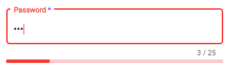
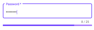
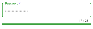
{{password.value.length}} / 25
</mat-hint>
</mat-form-field>
<mat-password-strength #passwordComponent
(onStrengthChanged)="onStrengthChanged($event)"
[password]="password.value">
</mat-password-strength>
</div>learn more about mat-form-field
Example of how to use the emitted strength of the password in your template
<div fxLayout="row" fxLayoutGap="10px">
                <div *ngIf="passwordComponent.strength === 100; then done else error">
                </div>
                <ng-template #done>
                  <mat-icon color="primary">done</mat-icon>
                </ng-template>
                <ng-template #error>
                  <mat-icon color="warn">error</mat-icon>
                </ng-template>
                <div>
                  <p>Password's strength = {{passwordComponent.strength}} %100</p>
                </div>
              </div>
Client Side password's validation using a built in angular formController
- add an input element to your template with an appropriate @angular-material-extensions/password-strength's component
- hold a reference of the @angular-material-extensions/password-strength's component by adding
passwordComponentWithValidation(or whatever you want) inside the element
e.g:
 <mat-password-strength #passwordComponentWithValidation
                       [password]="passwordWithValidation.value">
</mat-password-strength>- bind the form controller of the mat-password-strength to the input element
- you can access the form controller of @angular-material-extensions/password-strength using the chile view -->
passwordComponentWithValidation.passwordFormControl - bind the form controller to an input element -->
[formControl]="passwordComponentWithValidation.passwordFormControl"
- Full example - see below
<div>
  <mat-form-field appearance="outline" style="width: 100%">
    <mat-label>Password</mat-label>
    <input matInput #passwordWithValidation
           [type]="inputType"
           required
           [formControl]="passwordComponentWithValidation.passwordFormControl"
           placeholder="Password">
    <mat-hint align="end" aria-live="polite">
      {{passwordWithValidation.value.length}} / 25
    </mat-hint>
    <mat-error *ngIf="passwordComponentWithValidation.passwordFormControl.hasError('required')">
      Password is required
    </mat-error>
    <mat-error *ngIf="passwordComponentWithValidation.passwordFormControl.hasError('pattern')">
      Password is not valid
    </mat-error>
  </mat-form-field>
  <mat-password-strength #passwordComponentWithValidation
                                  (onStrengthChanged)="onStrengthChanged($event)"
                                  [password]="passwordWithValidation.value">
  </mat-password-strength>
  <!--Password's strength info-->
  <mat-password-strength-info
    [passwordComponent]="passwordComponentWithValidation">
  </mat-password-strength-info>
</div>
this will looks like -->
Documentation
Please checkout the full documentation here or follow the official tutorial
Run Demo App Locally
- clone this repo by running
$ git clone https://github.com/angular-material-extensions/password-strength.git- link the @angular-material-extensions/password-strength package use gulp globally
$ gulp linkuse gulp locally
$ npx gulp linkfor some mac os users, you may use the sudo command with gulp use gulp with sudo
$ sudo gulp linkor locally
$ sudo npx gulp link- navigate to the demo app directory
$ cd demo- install the dependencies
$ npm i- run/start/serve the app
$ npm run startor
$ ng serve --open- the app is now hosted by
http://localhost:4200/
Development
- clone this repo
- Install the dependencies by running
npm i - build the library
npm run buildorgulp buildTo generate all*.js,*.d.tsand*.metadata.jsonfiles:
$ npm run build- Link the library
- on windows
gulp linkor locallynpx gulp link - on mac/linux
sudo gulp linkor locallysudo npx gulp link
- Navigate to the demo app's directory
cd demo_npm i_npm start
extras
To lint all *.ts files:
$ npm run lintOther Angular Libraries
- ngx-auth-firebaseui
- @angular-material-extensions/pages
- @angular-material-extensions/contacts
- @angular-material-extensions/faq
- @angular-material-extensions/cards
- @angular-material-extensions/google-maps-autocomplete
- @angular-material-extensions/combination-generator
Support
- Drop an email to: Anthony Nahas
- or open an appropriate issue
- let us chat on Gitter
Built by and for developers ❤️ we will help you 👊
License
Copyright (c) 2018 Anthony Nahas. Licensed under the MIT License (MIT)