
Package Exports
- @ngx-popovers/popover
- @ngx-popovers/popover/package.json
Readme
popover
This library was generated with Nx using floating-ui for Angular apps
See Demo
Note
I strongly recommend not using this library until its stable version is released.
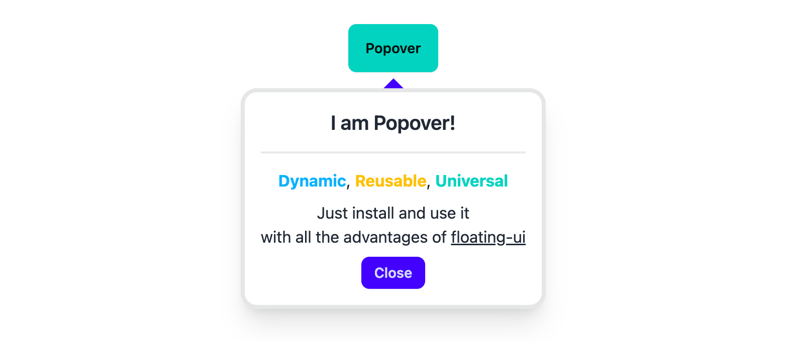
The popover is a very easy to use component, and it has a simple API. Just install and use.
You have to install the core package for the all abilities.
The core and the popover packages have the same versions.
Use the command below
npm i @ngx-popovers/corePopover component displays content next to the trigger element on mouse click
Usage
See more information about the properties in the official documentation floating-ui
First, import the popover module:
import { PopoverModule } from '@ngx-popovers/popover';This module has all necessary components. Then you can use the Popover in your templates.
<ngx-popover>
  <button>
    Toggle Popover
  </button>

  <!--
    Angular doesn't destroy elements in <ng-content />, so
    the PopoverTemplate component uses for conditional content projection.

    https://angular.io/guide/content-projection#conditional-content-projection
  -->
  <ng-template ngx-popover-template>
    <div class="example-class">
      <p>
        Lorem ipsum dolor sit amet.
      </p>
    </div>
  </ng-template>
</ngx-popover>
Arrow
You should install the core package to import the Arrow component.
import { Arrow } from '@ngx-popovers/core';Example usage:
<ngx-popover>
  <button>
    Toggle Popover
  </button>

  <ng-template ngx-popover-template>
    <div class="example-class">...</div>
  </ng-template>

  <ngx-arrow padding="8" />
</ngx-popover>
ngx-popover-close
The NgxPopoverClose directive closes popover
when handles a click to an element.
<ngx-popover>
  <button>
    Toggle Popover
  </button>

  <ng-template ngx-popover-template>
    <div class="example-class">
      ...
      <button ngx-popover-close>Close</button>
    </div>
  </ng-template>
</ngx-popover>
ngx-popover-anchor
You can have a several components inside the <ngx-popover />.
By default, the popover handles the all user's clicks, but it can be changed.
The ngxPopoverAnchor directive can be useful
if you want to change the trigger inside <ngx-popover />
<ngx-popover>
  <p>
    The clicks on this paragraph
    will not triggered the popover
  </p>

  <button ngx-popover-anchor>
    Anchor
  </button>

  <ng-template ngx-popover-template>
    <div class="example-class">
      ...
    </div>
  </ng-template>
</ngx-popover>
API
Input parameters
| Input | Description | Type | Default |
|---|---|---|---|
placement |
the popover position | Placement |
'bottom' |
middleware |
list of floating-ui middlewares without arrow |
MiddlewareList |
offset(4), flip() |
bindTo |
render popover into element | string | HTMLElement |
'.body' |
autoUpdate |
auto update the position of the Popover | boolean |
true |
disabled |
disables open/close on the trigger clicks | boolean |
false |
animationDisabled |
disables show/hide animations | boolean |
false |
value |
show or hide state of popover | boolean |
false |
Output parameters
| Output | Description | Type |
|---|---|---|
valueChange |
the value changes emitter |
EventEmitter<boolean> |
show |
emits when the popover shows | EventEmitter |
hide |
emits when the popover hides | EventEmitter |
clickedOutside |
emits when user clicks outside the floating element | EventEmitter<Element> |
clickedInside |
emits when user clicks inside the floating element. | EventEmitter<Element> |
animationStart |
emits when animation starts | EventEmitter<AnimationEvent> |
animationDone |
emits when animation ends | EventEmitter<AnimationEvent> |
computePosition |
emits every time when the floating component calls computePosition. |
EventEmitter<ComputePosition> |
Configuration
There is a configuration token NGX_POPOVER_CONFIG.
Please, use the NgxPopoverConfig class to change the default floating properties.
import { Provider } from '@angular/core';
import { NGX_POPOVER_CONFIG, NgxPopoverConfig } from '@ngx-popovers/popover';
/**
 * You have to install @ngx-popovers/core to import middleware.
 * Version of @ngx-popovers/core is the same as @ngx-popovers/popover
 */
import { flip, offset, shift } from '@ngx-popovers/core';

export const PopoverConfigProvider: Provider = {
  provide: NGX_POPOVER_CONFIG,
  useValue: new NgxPopoverConfig({
    placement: 'top-end',
    arrow: true,
    closeOnClickedOutside: true,
    /* Middleware list from floating-ui */
    middleware: [
      flip(),
      shift(),
      offset(8)
    ]
  })
};
And then just add your new provider to any module:
@Component({
  selector: 'example-app-module',
  standalone: true,
  imports: [],
  providers: [
    PopoverConfigProvider
  ],
  template: ``,
})
Arrow component
See the core package
Sources
Another packages from this library: