
Package Exports
- hs-uix
- hs-uix/datatable
- hs-uix/form
Readme
hs-uix


Production-ready UI components for HubSpot UI Extensions. Built entirely on HubSpot's native primitives — no custom HTML, no CSS, no iframes.
Install
npm install hs-uiximport { DataTable } from "hs-uix/datatable";
import { FormBuilder } from "hs-uix/form";
// or import everything from the root
import { DataTable, FormBuilder } from "hs-uix";Requires react >= 18.0.0 and @hubspot/ui-extensions >= 0.12.0 as peer dependencies (already present in any HubSpot UI Extensions project).
Components
| Component | Description | Docs |
|---|---|---|
| DataTable | Filterable, sortable, paginated table with auto-sized columns, inline editing, row grouping, and more | Full documentation |
| FormBuilder | Declarative, config-driven form with validation, multi-step wizards, and 20+ field types | Full documentation |
DataTable
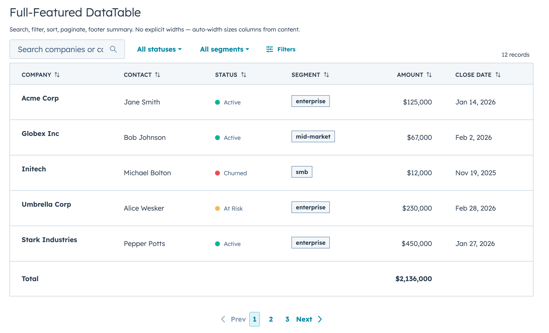
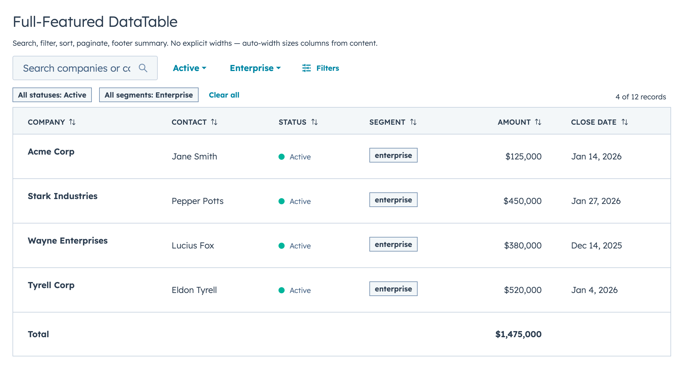
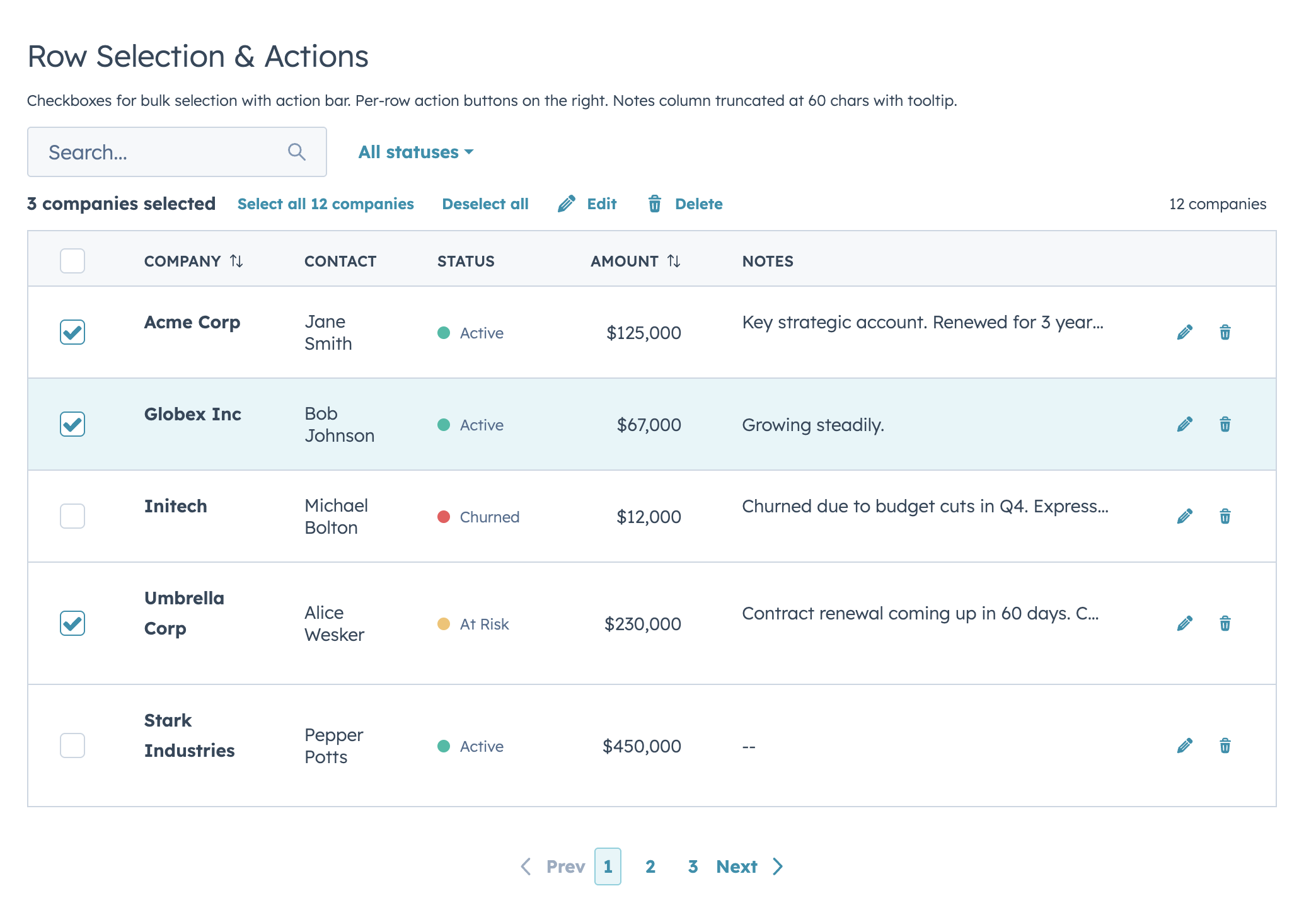
A drop-in table component for HubSpot UI Extensions. Define your columns, pass your data, and you get search, filtering, sorting, pagination, inline editing, row grouping, and auto-sized columns out of the box.
Quick Start
import { DataTable } from "hs-uix/datatable";

const COLUMNS = [
  { field: "name", label: "Company", sortable: true, renderCell: (val) => val },
  { field: "status", label: "Status", renderCell: (val) => <StatusTag>{val}</StatusTag> },
  { field: "amount", label: "Amount", sortable: true, renderCell: (val) => formatCurrency(val) },
];

<DataTable data={deals} columns={COLUMNS} searchFields={["name"]} pageSize={10} />
That's a searchable, sortable, paginated table with auto-sized columns in 5 lines of config.
Features
- Full-text search with optional fuzzy matching via Fuse.js
- Select, multi-select, and date range filters with active badges and clear/reset controls
- Click-to-sort headers with three-state cycling
- Client-side or server-side pagination
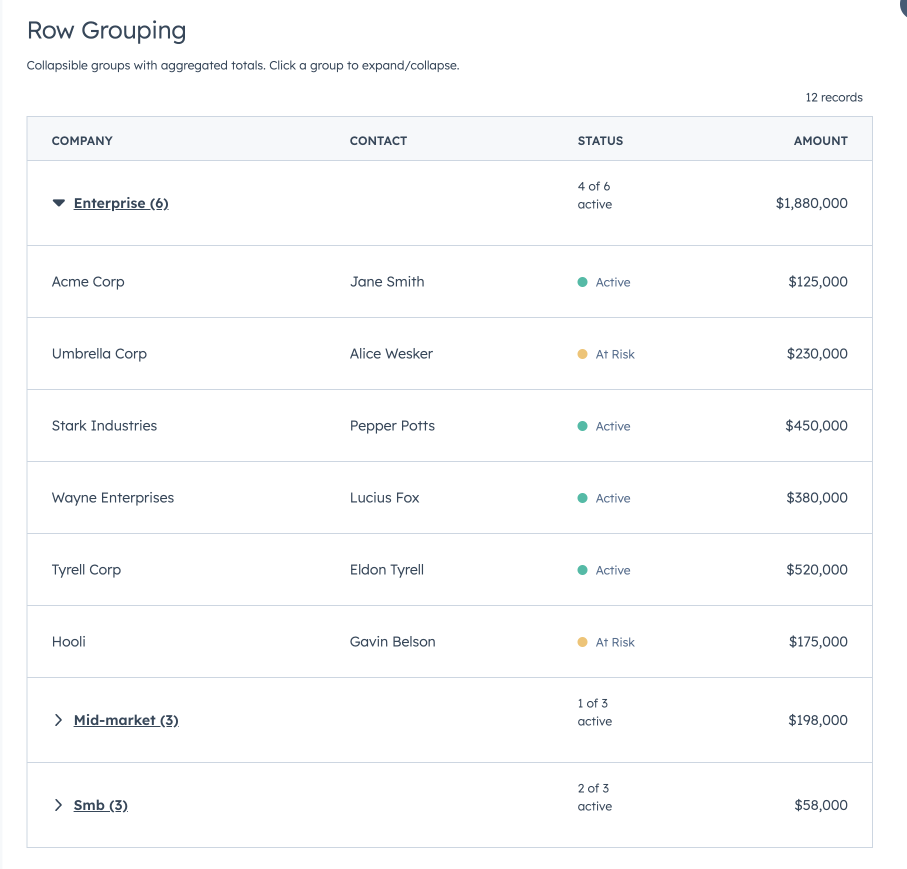
- Collapsible row groups with per-column aggregation
- Row selection with bulk action bar
- Per-row actions via
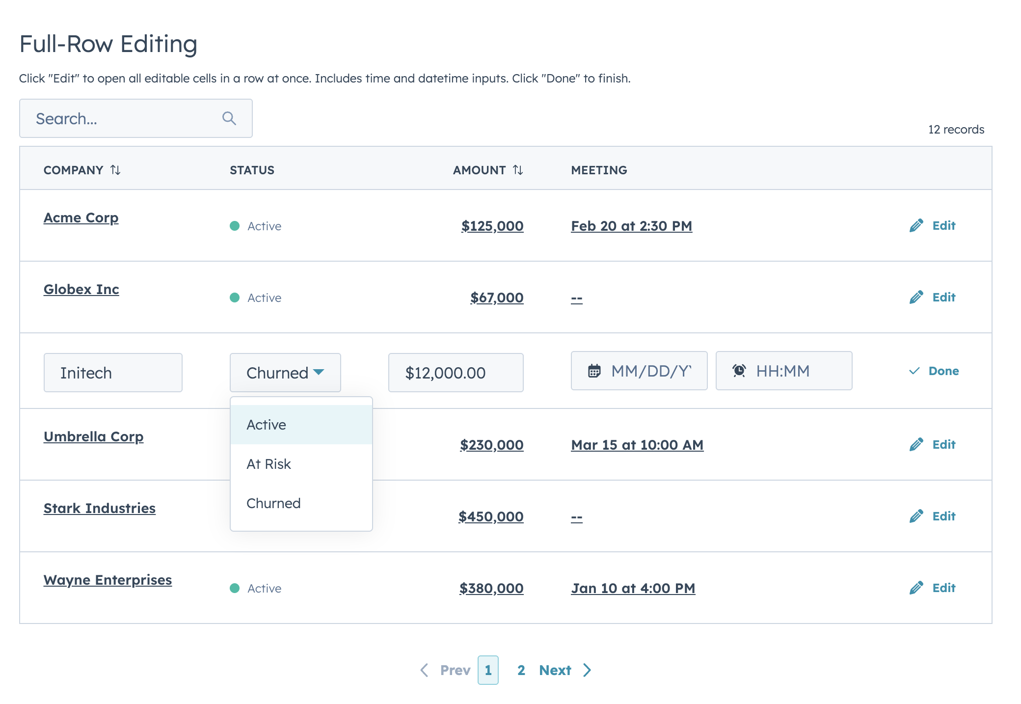
rowActions - Two edit modes (discrete click-to-edit and inline always-visible) supporting 12 input types with validation
- Auto-width column sizing based on data analysis
- Column-level footer for totals rows
- Works with
useAssociationsfor live CRM data - Server-side mode with loading/error states, search debounce, and unified
onParamsChangecallback
Highlights
Filters & Footer Totals
Row Selection & Bulk Actions
Inline Editing
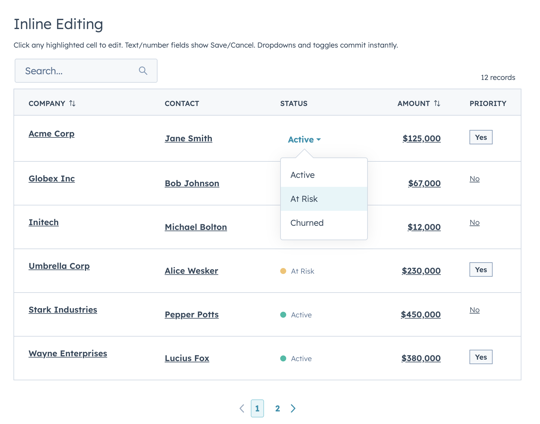
Two edit modes: discrete (click-to-edit, default) and inline (always-visible inputs). Supports text, textarea, number, currency, stepper, select, multiselect, date, time, datetime, toggle, and checkbox.
Row Grouping
Full-Row Editing
useAssociations
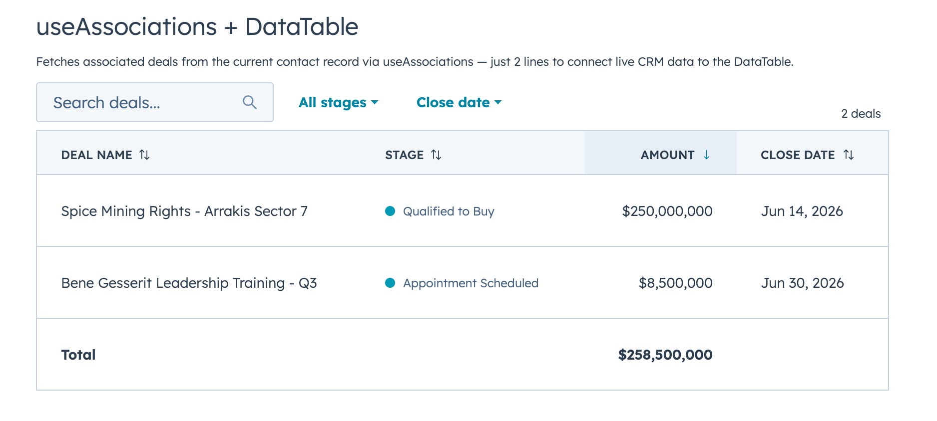
Connect live CRM data (contacts, deals, tickets, etc.) to a DataTable with useAssociations from @hubspot/ui-extensions/crm.
FormBuilder
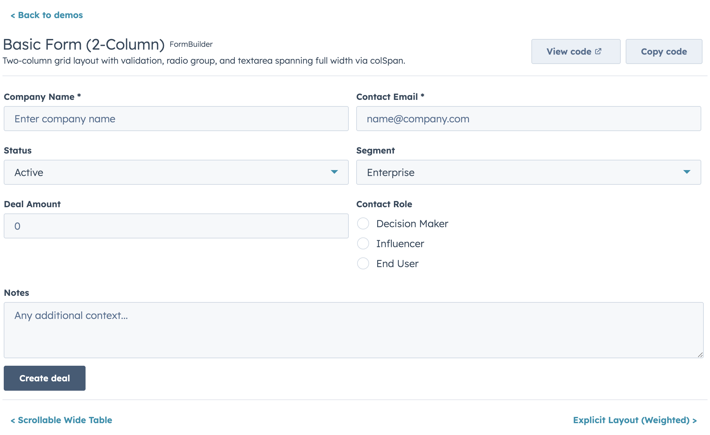
Declarative, config-driven forms for HubSpot UI Extensions. Define fields as data, get a complete form with validation, layout, multi-step wizards, and full HubSpot component integration.
Quick Start
import { FormBuilder } from "hs-uix/form";

const fields = [
  { name: "firstName", type: "text", label: "First name", required: true },
  { name: "lastName", type: "text", label: "Last name", required: true },
  { name: "email", type: "text", label: "Email", pattern: /^[^\s@]+@[^\s@]+$/, patternMessage: "Enter a valid email" },
];

<FormBuilder
  columns={2}
  fields={fields}
  onSubmit={(values) => console.log(values)}
/>
Features
- 20+ field types mapping to native HubSpot components (
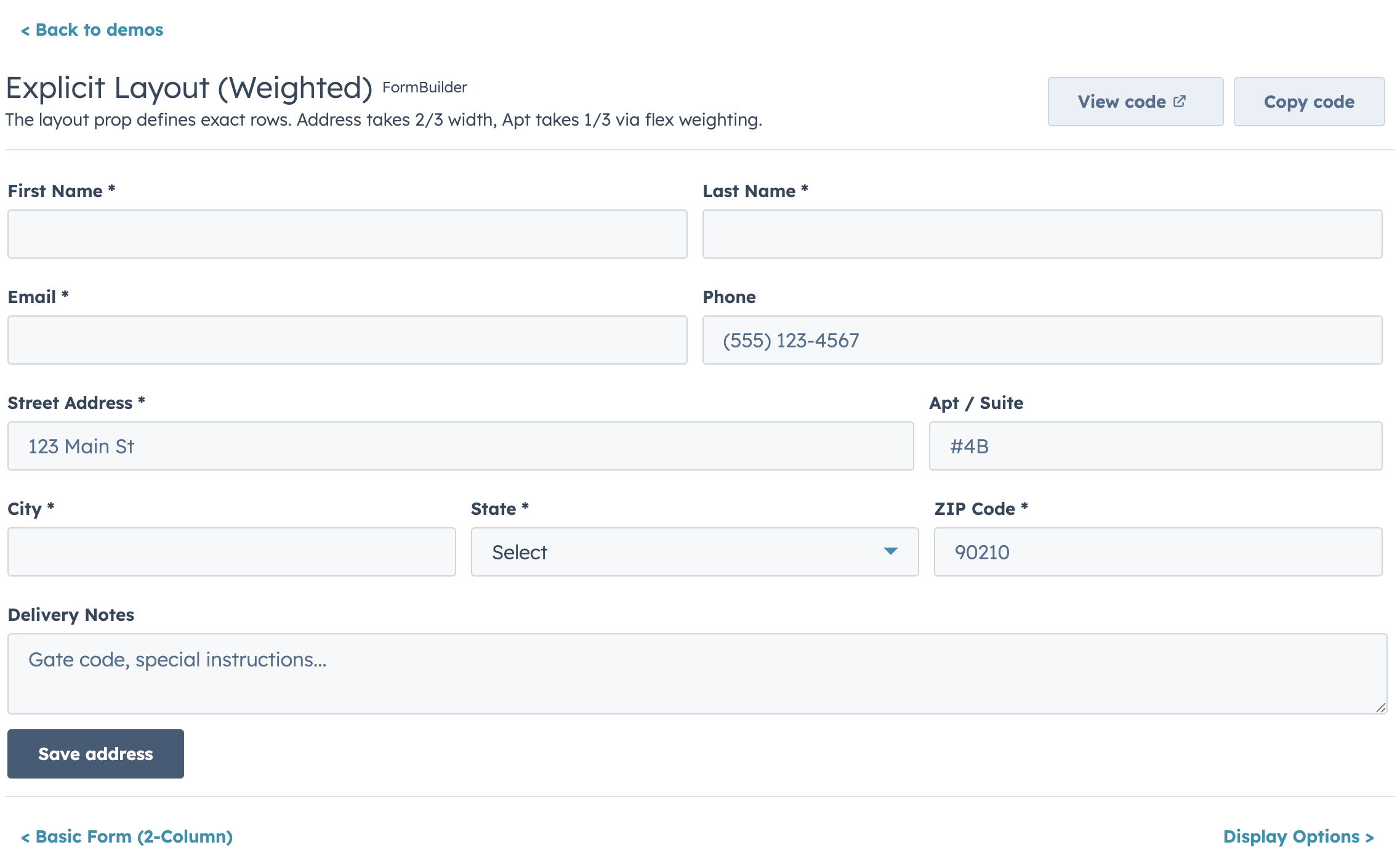
text,number,select,date,toggle,repeater,crmPropertyList, and more) - Four layout modes: fixed columns, responsive AutoGrid, explicit row layout, and legacy half-width
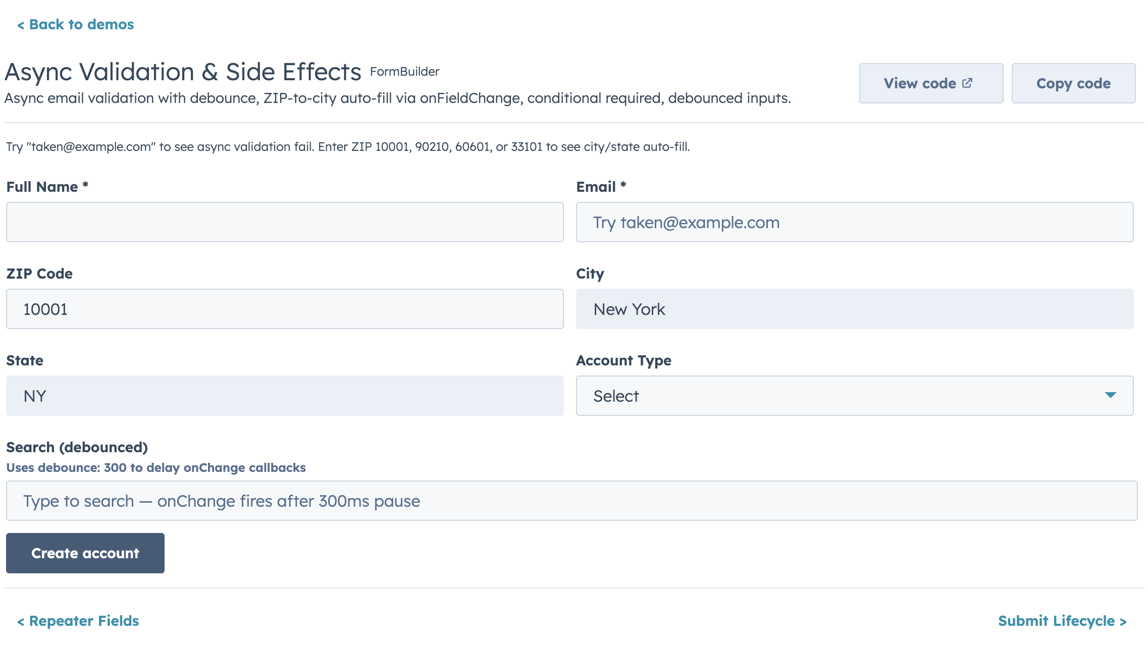
- Built-in validation chain: required, pattern, length/range, custom sync, and custom async with loading indicators
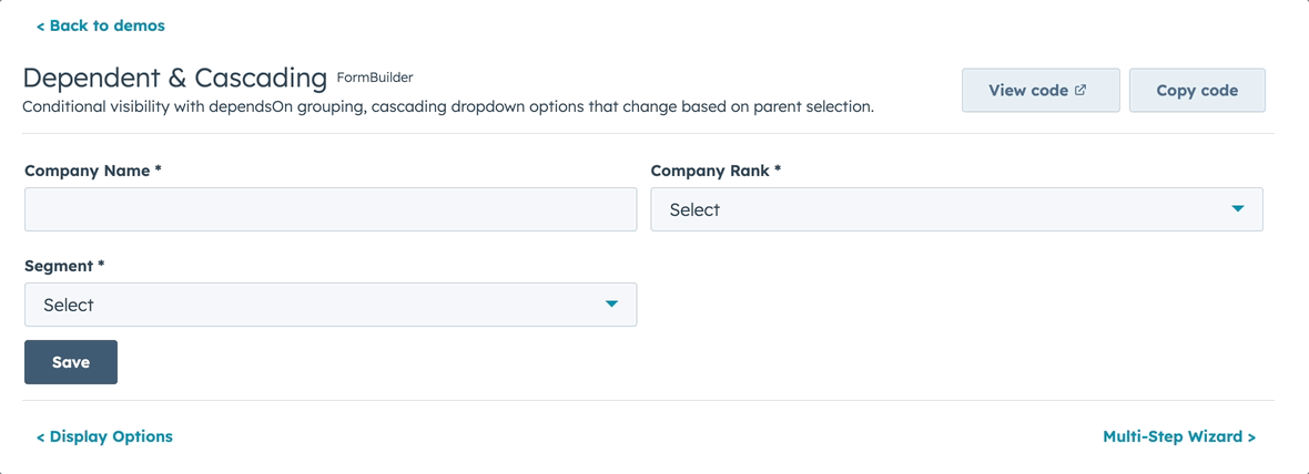
- Conditional visibility and dependent property grouping
- Multi-step wizards with per-step validation
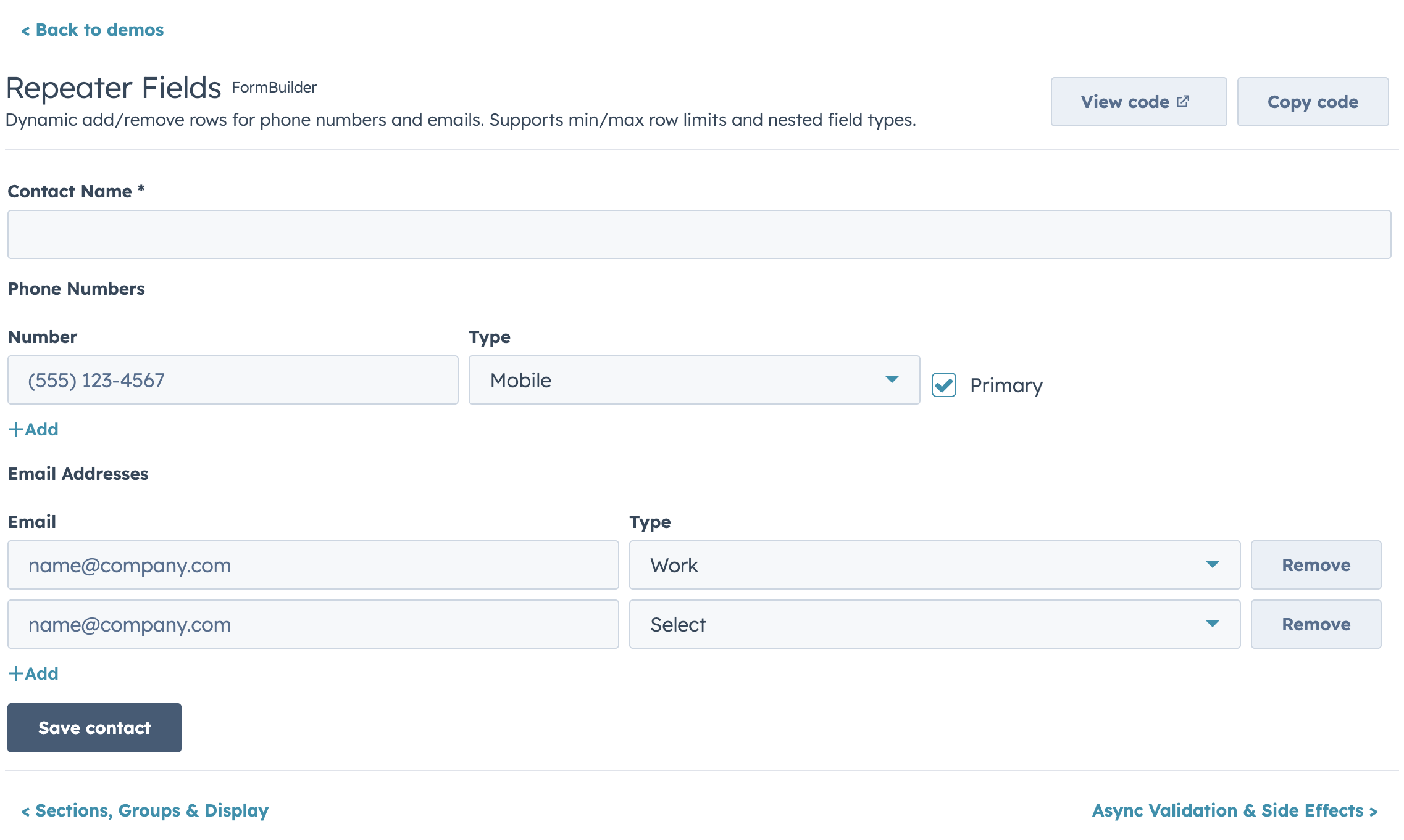
- Repeater fields for dynamic add/remove rows
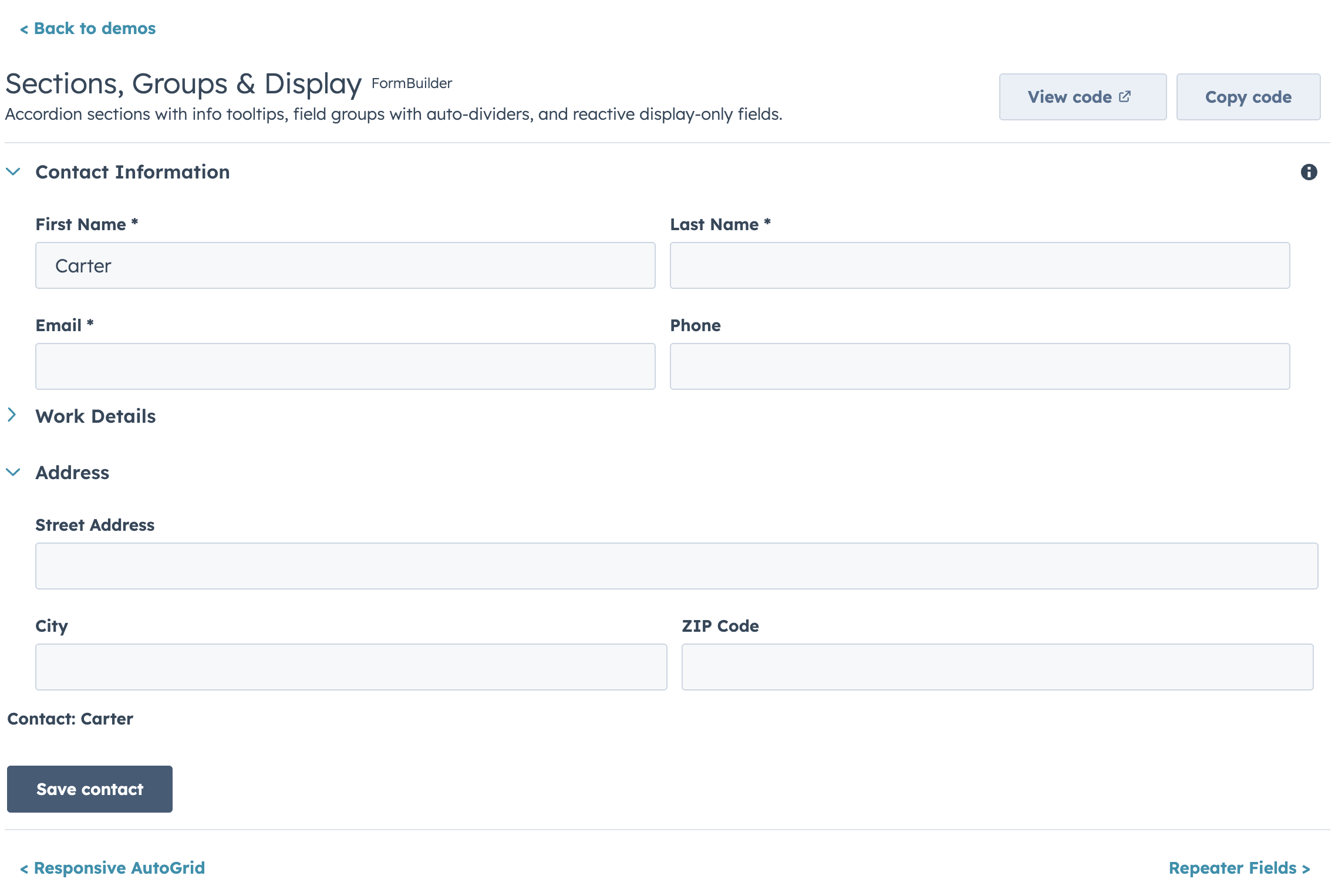
- Accordion sections and field group dividers
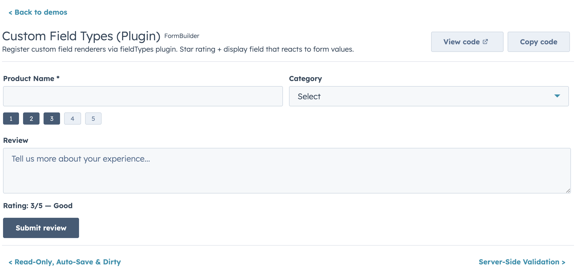
- Custom field type plugin registry
- Controlled and uncontrolled modes
- Ref API for imperative access (
submit,validate,reset,getValues,setFieldValue, etc.) - Submit lifecycle hooks (
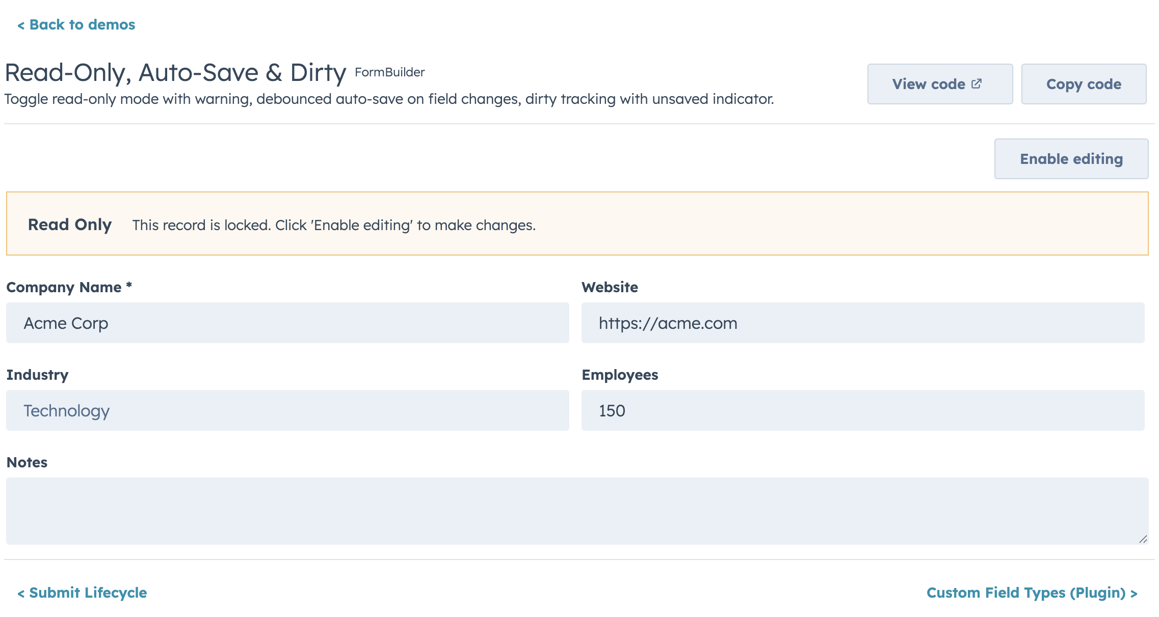
transformValues,onBeforeSubmit,onSubmitSuccess,onSubmitError) - Auto-save, dirty tracking, read-only mode, and form-level alerts
Highlights
Layout
Conditional Visibility & Dependent Properties
Async Validation
Repeater Fields
Sections & Groups
Custom Field Types
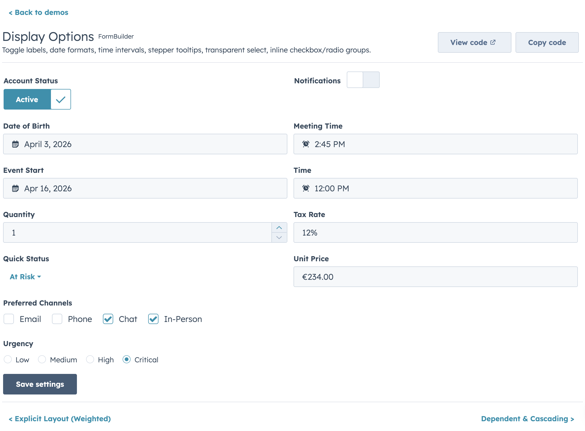
Display Options
Read-Only Mode
Migrating from @hs-uix/datatable or @hs-uix/form
Both packages have been merged into hs-uix. Update your imports:
- import { DataTable } from "@hs-uix/datatable";
+ import { DataTable } from "hs-uix/datatable";

- import { FormBuilder } from "@hs-uix/form";
+ import { FormBuilder } from "hs-uix/form";
npm uninstall @hs-uix/datatable @hs-uix/form
npm install hs-uixLicense
MIT