
Package Exports
This package does not declare an exports field, so the exports above have been automatically detected and optimized by JSPM instead. If any package subpath is missing, it is recommended to post an issue to the original package (ngx-image-annotation) to support the "exports" field. If that is not possible, create a JSPM override to customize the exports field for this package.
Readme
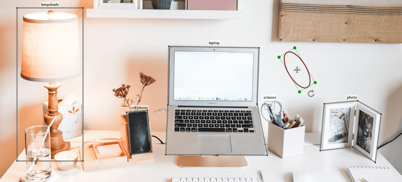
A comprehensive Angular component for tagging images. Check out the demo for some examples.
Features
- Bounding Box (Rectangle, Square, Circle, and Ellipse), and Polygon Annotations
- Add, Edit, Drag, Rotate, and Delete Annotations
- Zoom and Pan
- Changing image on the fly
- Colorful annotations
- Raw or typed input/output
Usage
Install ngx-image-annotation using npm.
npm install ngx-image-annotationThen you can just import the component:
import { AnnotatorComponent } from "ngx-image-annotation";

@Component({
  imports: [AnnotatorComponent],
  ...
and use it as below:
@ViewChild('annotator') annotator!:AnnotatorComponent;<annotator
#annotator
[naturalSize]="true"
[imageUrl]="your-image-url"
[shortcut]="{del: true, bksp: true }"
(onReady)="annotator.drawRectangle()"/>Now you can draw rectangles on the image by dragging the left mouse button.
Mouse and Keyboard events
- click: Edit/Stop Edit Annotations
- Ctrl + mouse wheel: Zoom
- Ctrl + mouse drag: Pan
- mouse drag: Drag/Edit/Rotate Annotations
when using [shortcut]="{del: true, bksp: true }" as an input (see Shortcut Settings):
- Delete/Backspace key: Delete Annotations
Inputs/Outputs
The following inputs/outputs can be sent to or received from annotator:
| Input/Output | Type | Description | Default |
|---|---|---|---|
[imageUrl] * |
string |
Use a state for image url if you want to change it on the fly | |
[shapes] |
Shape[] | any[] |
Annotations being displayed on load (see shapes) | |
[naturalSize] |
boolean |
To show image in its natural size | false |
[width] |
number | string |
container width in pixels or percentage |
image.getBBox().width |
[height] |
number | string |
container height in pixels or percentage |
image.getBBox().height |
[discRadius] |
number |
The radius of the green discs in edit mode | 5 |
[hideBorder] |
boolean |
To hide annotation border | false |
[shortcut] |
Shortcut |
To configure shortcuts (see Shortcut Settings) | |
(onAdded) |
Shape => any |
When an annotation is drawn (see Annotations with Categories) | |
(onEdited) |
Shape => any |
When an annotation is reshaped, dragged, or rotated | |
(onSelected) |
Shape => any |
When an annotation goes into edit mode by double-clicking | |
(onContextMenu) |
Shape => any |
When an annotation is right-clicked (see Annotations with Categories) | |
(onReady) |
() => any |
When the component is mounted |
(*) required
Parent calls using @ViewChild
The parent component can access the annotator methods using the local variable technique. For example, you can start drawing circles as follows:
<button (click)="annotator.drawCircle()">Add Circle</button>Below is a list of all methods:
| Method | Type | Description |
|---|---|---|
drawCircle |
() => void |
Allows drawing circles by dragging the left mouse button |
drawEllipse |
() => void |
Allows drawing ellipses by dragging the left mouse button |
drawRectangle |
() => void |
Allows drawing rectangles by dragging the left mouse button (keep the shift key to draw square) |
drawPolygon |
() => void |
Allows drawing polygons by clicking and double-clicking |
drawDot |
() => void |
Allows adding dots (points) by clicking |
stop |
() => void |
Stops draw/edit/drag mode |
edit |
(id: number) => void |
The annotation identified by id can be edited and dragged |
delete |
(id: number) => void |
Removes the annotation identified by id |
stopEdit |
() => void |
Stops editing and dragging |
updateCategories |
(id: number, categories: string[], color?: string) => void |
Updates the categories associated with the annotation identified by id |
zoom |
(factor: number) => void |
Multiplies the dimensions by factor |
getShapes |
() => Shape[] |
Gets all annotations (shapes) |
getContainer |
HTMLDivElement |
The div wrapping the SVG |
Annotations with Categories
To attach one or more categories to an annotation, utilize onAdded and onContextMenu outputs being called when an annotation is drawn and right-clicked, respectively. Use shape.categories to get the previous categories as string[]:
showCategoriesDialog(shape: Shape) {
  console.log(shape.id) // 1
  console.log(shape.getCenterWithOffset()) // { X: 247.5, Y: 193 }
  console.log(shape.categories) // string []
  // Show a category selection component
}<annotator
(onAdded)="showCategoriesDialog($event)"
(onContextMenu)="showCategoriesDialog($event)"
...Finally, call annotator.updateCategories to update the categories of the annotation.
Shapes
The data models for all shapes are listed below:
| Shape | Data Model | type Value |
|---|---|---|
Circle |
{ id: number, centre: [number, number], radius: number, categories: string[], type: string, color: string } |
circle |
Ellipse |
{ id: number, centre: [number, number], radiusX: number, radiusY: number, phi: number, categories: string[], type: string, color: string } |
ellipse |
Rectangle |
{ id: number, points: [number, number][], phi: number, categories: string[], type: string, color: string } |
rectangle |
Polygon |
{ id: number, points: [number, number][], categories: string[], type: string, color: string } |
polygon |
Dot |
{ id: number, position: [number, number], categories: string[], type: string, color: string } |
dot |
Shortcut Settings
Below is a list of shortcuts that are configured through shortcut prop:
| Key | Type | Description | Default |
|---|---|---|---|
del |
boolean | To enable the Delete key to remove the annotation that is in edit mode | false |
bksp |
boolean | To enable the Backspace key to remove the annotation that is in edit mode | false |
Contributing
- Fork the project.
- Make changes.
- Run the project in development mode:
npm run start. - Write your own tests and/or update existing ones in src/test dir.
- Check the new features and changes using
demo.ts. - Update README with appropriate docs.
- Commit and PR
Dependencies
The package is dependent on image-labeling package. The following peer dependencies must be specified by your project in order to avoid version conflicts:
@angular/core,
@angular/common.
NPM will not automatically install these for you but it will show you a warning message with instructions on how to install them.