
Package Exports
- ngx-image-annotation
- ngx-image-annotation/package.json
Readme
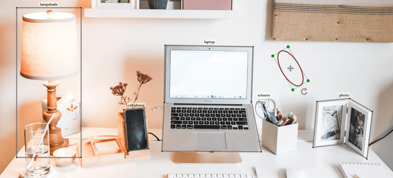
A comprehensive Angular component for tagging images. Check out the demo for some examples.
Features
- Bounding Box (Rectangle, Square, Circle, and Ellipse), and Polygon Annotations
- Add, Edit, Drag, Rotate, and Delete Annotations
- Zoom and Pan
- Changing image on the fly
- Colorful annotations
- Raw or typed input/output
Usage
Install ngx-image-annotation using npm.
npm install ngx-image-annotationThen you can just import the component:
import { AnnotatorComponent } from "ngx-image-annotation";

@Component({
  imports: [AnnotatorComponent],
  ...
and use it as below:
@ViewChild('annotator') annotator!:AnnotatorComponent;<annotator
#annotator
[naturalSize]="true"
[imageUrl]="your-image-url"
[shortcut]="{del: true, bksp: true }"
(onReady)="annotator.drawRectangle()"/>Now you can draw rectangles on the image by dragging the left mouse button.
Mouse and Keyboard events
- click: Edit/Stop Edit Annotations
- Ctrl + mouse wheel: Zoom
- Ctrl + mouse drag: Pan
- mouse drag: Drag/Edit/Rotate Annotations
when using [shortcut]="{del: true, bksp: true }" as an input (see Shortcut Settings):
- Delete/Backspace key: Delete Annotations
Inputs/Outputs
The following inputs/outputs can be sent to or received from annotator:
| Input/Output | Type | Description | Default |
|---|---|---|---|
[imageUrl] * |
string |
Use a state for image url if you want to change it on the fly | |
[shapes] |
Shape[] | any[] |
Annotations being displayed on load (see shapes) | |
[naturalSize] |
boolean |
To show image in its natural size | false |
[width] |
number | string |
container width in pixels or percentage |
image.getBBox().width |
[height] |
number | string |
container height in pixels or percentage |
image.getBBox().height |
[discRadius] |
number |
The radius of the green discs in edit mode | 5 |
[hideBorder] |
boolean |
To hide annotation border | false |
[shortcut] |
Shortcut |
To configure shortcuts (see Shortcut Settings) | |
(onAdded) |
Shape => any |
When an annotation is drawn (see Annotations with Categories) | |
(onEdited) |
Shape => any |
When an annotation is reshaped, dragged, or rotated | |
(onSelected) |
Shape => any |
When an annotation goes into edit mode by double-clicking | |
(onContextMenu) |
Shape => any |
When an annotation is right-clicked (see Annotations with Categories) | |
(onReady) |
() => any |
When the component is mounted |
(*) required
Parent calls using @ViewChild
The parent component can access the annotator methods using the local variable technique. For example, you can start drawing circles as follows:
<button (click)="annotator.drawCircle()">Add Circle</button>Below is a list of all methods:
| Method | Type | Description |
|---|---|---|
drawCircle |
() => void |
Allows drawing circles by dragging the left mouse button |
drawEllipse |
() => void |
Allows drawing ellipses by dragging the left mouse button |
drawRectangle |
() => void |
Allows drawing rectangles by dragging the left mouse button (keep the shift key to draw square) |
drawPolygon |
() => void |
Allows drawing polygons by clicking and double-clicking |
drawDot |
() => void |
Allows adding dots (points) by clicking |
stop |
() => void |
Stops draw/edit/drag mode |
edit |
(id: number) => void |
The annotation identified by id can be edited and dragged |
delete |
(id: number) => void |
Removes the annotation identified by id |
stopEdit |
() => void |
Stops editing and dragging |
updateCategories |
(id: number, categories: string[], color?: string) => void |
Updates the categories associated with the annotation identified by id |
zoom |
(factor: number) => void |
Multiplies the dimensions by factor |
getShapes |
() => Shape[] |
Gets all annotations (shapes) |
getContainer |
HTMLDivElement |
The div wrapping the SVG |
Annotations with Categories
To attach one or more categories to an annotation, utilize onAdded and onContextMenu outputs being called when an annotation is drawn and right-clicked, respectively. Use shape.categories to get the previous categories as string[]:
showCategoriesDialog(shape: Shape) {
  console.log(shape.id) // 1
  console.log(shape.getCenterWithOffset()) // { X: 247.5, Y: 193 }
  console.log(shape.categories) // string []
  // Show a category selection component
}<annotator
(onAdded)="showCategoriesDialog($event)"
(onContextMenu)="showCategoriesDialog($event)"
...Finally, call annotator.updateCategories to update the categories of the annotation.
Shapes
The data models for all shapes are listed below:
| Shape | Data Model | type Value |
|---|---|---|
Circle |
{ id: number, centre: [number, number], radius: number, categories: string[], type: string, color: string } |
circle |
Ellipse |
{ id: number, centre: [number, number], radiusX: number, radiusY: number, phi: number, categories: string[], type: string, color: string } |
ellipse |
Rectangle |
{ id: number, points: [number, number][], phi: number, categories: string[], type: string, color: string } |
rectangle |
Polygon |
{ id: number, points: [number, number][], categories: string[], type: string, color: string } |
polygon |
Dot |
{ id: number, position: [number, number], categories: string[], type: string, color: string } |
dot |
Shortcut Settings
Below is a list of shortcuts that are configured through shortcut prop:
| Key | Type | Description | Default |
|---|---|---|---|
del |
boolean | To enable the Delete key to remove the annotation that is in edit mode | false |
bksp |
boolean | To enable the Backspace key to remove the annotation that is in edit mode | false |
Contributing
- Fork the project.
- Make changes.
- Run the project in development mode:
npm run start. - Write your own tests and/or update existing ones in src/test dir.
- Check the new features and changes using
demo.ts. - Update README with appropriate docs.
- Commit and PR
Dependencies
The package is dependent on image-labeling package. The following peer dependencies must be specified by your project in order to avoid version conflicts:
@angular/core,
@angular/common.
NPM will not automatically install these for you but it will show you a warning message with instructions on how to install them.