
Package Exports
- rc-calendar
- rc-calendar/assets/index.css
- rc-calendar/lib/Picker
This package does not declare an exports field, so the exports above have been automatically detected and optimized by JSPM instead. If any package subpath is missing, it is recommended to post an issue to the original package (rc-calendar) to support the "exports" field. If that is not possible, create a JSPM override to customize the exports field for this package.
Readme
rc-calendar
calendar ui component for react, port from https://github.com/modulex/date-picker


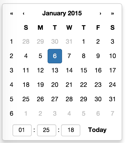
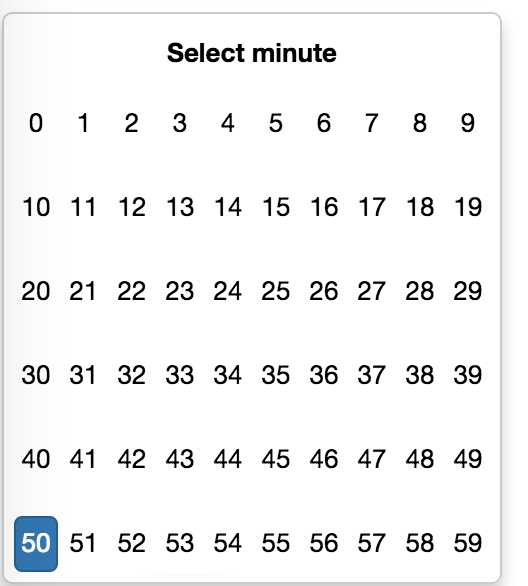
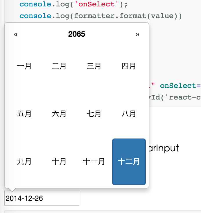
Screenshots
Feature
- support ie8,ie8+,chrome,firefox,safari
- support date, month, year, decade select panel
- support week number
- support en-us and zh-cn locale (ui and timeOffset)
- support aria and keyboard accessibility
Keyboard
- Previous month (PageUp)
- Next month (PageDown)
- tab into hour input: Last hour(Up), Next hour(Down)
- tab into hour input: Last minute(Up), Next minute(Down)
- tab into hour input: Last second(Up), Next second(Down)
- Last year (Control + left)
- Next year (Control + right)
install

Usage
import Calendar from 'rc-calendar';
import React from 'react';
React.render(<Calendar />, container);
Development
npm install
npm start
Example
http://localhost:8001/examples/
online example:
http://react-component.github.io/calendar/examples/index.html
API
Calendar props
| name | type | default | description |
|---|---|---|---|
| prefixCls | String | prefixCls of this component | |
| className | String | additional css class of root dom node | |
| style | Object | additional style of root dom node | |
| value | GregorianCalendar | current value like input's value | |
| defaultValue | GregorianCalendar | defaultValue like input's defaultValue | |
| orient | String[] | affect the position of arrow. exp: ['left','top'] | |
| locale | Object | import from 'rc-calendar/lib/locale/en-us' | calendar locale |
| disabledDate | Function(current:GregorianCalendar):Boolean | null | whether to disable select of current date |
| showWeekNumber | Boolean | false | whether to show week number of year |
| showToday | Boolean | true | whether to show today button |
| showTime | Boolean | true | whether to support time select |
| focused | Boolean | false | whether to focus on render |
| onSelect | Function(GregorianCalendar date) | function(){} | called when a date is selected from calendar |
| onBlur | Function() | function(){} | called when calendar loose focus |
Calendar.Picker props
| name | type | default | description |
|---|---|---|---|
| prefixCls | String | prefixCls of this component | |
| calendar | Calendar React Element | ||
| disabled | Boolean | whether picker is disabled | |
| adjustOrientOnCalendarOverflow | Boolean | true | whether adjust calendar orient if there is not enough space to show. better false if animation is 'slide-up' |
| animation | String | index.css support 'slide-up' | |
| transitionName | String | css class for animation | |
| renderCalendarToBody | Boolean | false | whether render picker's calendar to document.body |
| formatter | GregorianCalendarFormatter | use to format/parse value to/from input | |
| trigger | React.Element | additional trigger appended to picker | |
| value | GregorianCalendar | current value like input's value | |
| defaultValue | GregorianCalendar | defaultValue like input's defaultValue | |
| onChange | Function | called when select a different value |
Test Case
http://localhost:8001/tests/runner.html?coverage
Coverage
License
rc-calendar is released under the MIT license.