
Package Exports
- rc-calendar
- rc-calendar/assets/index.css
- rc-calendar/es/FullCalendar
- rc-calendar/es/MonthCalendar
- rc-calendar/es/Picker
- rc-calendar/es/RangeCalendar
- rc-calendar/es/locale/bg_BG
- rc-calendar/es/locale/ca_ES
- rc-calendar/es/locale/cs_CZ
- rc-calendar/es/locale/da_DK
- rc-calendar/es/locale/de_DE
- rc-calendar/es/locale/en_GB
- rc-calendar/es/locale/en_US
- rc-calendar/es/locale/es_ES
- rc-calendar/es/locale/et_EE
- rc-calendar/es/locale/fa_IR
- rc-calendar/es/locale/fi_FI
- rc-calendar/es/locale/fr_BE
- rc-calendar/es/locale/fr_FR
- rc-calendar/es/locale/it_IT
- rc-calendar/es/locale/ja_JP
- rc-calendar/es/locale/ko_KR
- rc-calendar/es/locale/nb_NO
- rc-calendar/es/locale/nl_BE
- rc-calendar/es/locale/nl_NL
- rc-calendar/es/locale/pl_PL
- rc-calendar/es/locale/pt_BR
- rc-calendar/es/locale/ru_RU
- rc-calendar/es/locale/sk_SK
- rc-calendar/es/locale/sv_SE
- rc-calendar/es/locale/th_TH
- rc-calendar/es/locale/tr_TR
- rc-calendar/es/locale/zh_CN
- rc-calendar/es/locale/zh_TW
- rc-calendar/lib/FullCalendar
- rc-calendar/lib/MonthCalendar
- rc-calendar/lib/Picker
- rc-calendar/lib/RangeCalendar
- rc-calendar/lib/locale/bg_BG
- rc-calendar/lib/locale/ca_ES
- rc-calendar/lib/locale/cs_CZ
- rc-calendar/lib/locale/da_DK
- rc-calendar/lib/locale/de_DE
- rc-calendar/lib/locale/en_GB
- rc-calendar/lib/locale/en_US
- rc-calendar/lib/locale/es_ES
- rc-calendar/lib/locale/et_EE
- rc-calendar/lib/locale/fa_IR
- rc-calendar/lib/locale/fi_FI
- rc-calendar/lib/locale/fr_BE
- rc-calendar/lib/locale/fr_FR
- rc-calendar/lib/locale/it_IT
- rc-calendar/lib/locale/ja_JP
- rc-calendar/lib/locale/ko_KR
- rc-calendar/lib/locale/nb_NO
- rc-calendar/lib/locale/nl_BE
- rc-calendar/lib/locale/nl_NL
- rc-calendar/lib/locale/pl_PL
- rc-calendar/lib/locale/pt_BR
- rc-calendar/lib/locale/ru_RU
- rc-calendar/lib/locale/sk_SK
- rc-calendar/lib/locale/sv_SE
- rc-calendar/lib/locale/th_TH
- rc-calendar/lib/locale/tr_TR
- rc-calendar/lib/locale/zh_CN
- rc-calendar/lib/locale/zh_CN.js
- rc-calendar/lib/locale/zh_TW
This package does not declare an exports field, so the exports above have been automatically detected and optimized by JSPM instead. If any package subpath is missing, it is recommended to post an issue to the original package (rc-calendar) to support the "exports" field. If that is not possible, create a JSPM override to customize the exports field for this package.
Readme
rc-calendar
React Calendar


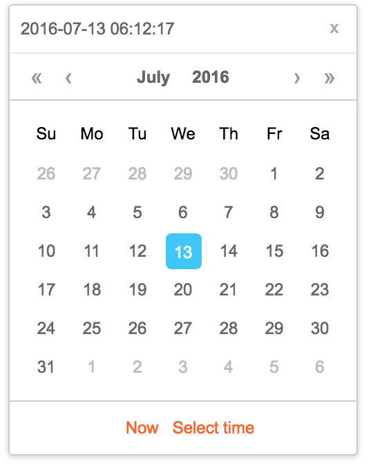
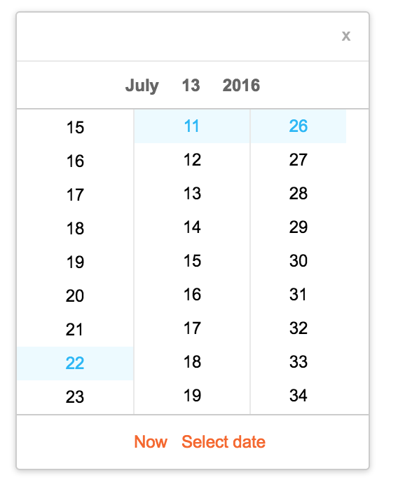
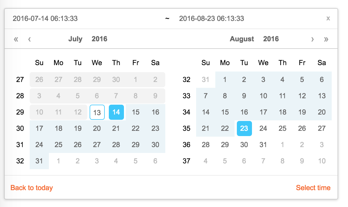
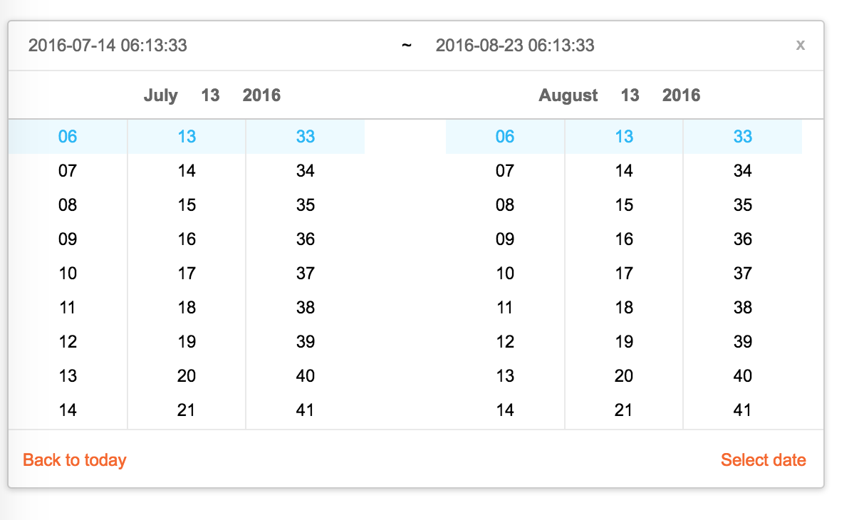
Screenshots
Feature
- support ie9,ie9+,chrome,firefox,safari
- support date, month, year, decade select panel
- support week number
- support en_US and zh_CN locale(UI), use moment.utcOffset to set timezone
- support aria and keyboard accessibility
Keyboard
- Previous month (PageUp)
- Next month (PageDown)
- tab into hour input: Last hour(Up), Next hour(Down)
- tab into hour input: Last minute(Up), Next minute(Down)
- tab into hour input: Last second(Up), Next second(Down)
- Last year (Control + left)
- Next year (Control + right)
install

Usage
import Calendar from 'rc-calendar';
import React from 'react';
import ReactDOM from 'react-dom';
ReactDOM.render(<Calendar />, container);
Development
npm install
npm start
Example
http://localhost:8002/examples/
online example:
http://react-component.github.io/calendar/examples/index.html
API
rc-calendar props
| name | type | default | description |
|---|---|---|---|
| prefixCls | String | prefixCls of this component | |
| className | String | additional css class of root dom node | |
| style | Object | additional style of root dom node | |
| dateRender | (current, value) => React.Node | date cell | |
| renderSidebar | () => React.Node | side bar | |
| renderFooter | () => React.Node | extra footer | |
| value | moment | current value like input's value | |
| defaultValue | moment | defaultValue like input's defaultValue | |
| locale | Object | import from 'rc-calendar/lib/locale/en_US' | calendar locale |
| format | String | depends on whether you set timePicker and your locale | use to format/parse date(without time) value to/from input |
| disabledDate | Function(current:moment):Boolean | whether to disable select of current date | |
| disabledTime | Function(current:moment):Object | a function which return a object with member of disabledHours/disabledMinutes/disabledSeconds according to rc-time-picker | |
| showDateInput | Boolean | true | whether to show input on top of calendar panel |
| showWeekNumber | Boolean | false | whether to show week number of year |
| showToday | Boolean | true | whether to show today button |
| showOk | Boolean | auto | whether has ok button in footer |
| timePicker | React Element | rc-timer-picker/lib/module/panel element | |
| onSelect | Function(date: moment) | called when a date is selected from calendar | |
| onChange | Function(date: moment) | called when a date is changed inside calendar (next year/next month/keyboard) | |
| dateInputPlaceholder | String | date input's placeholder |
rc-calendar/lib/RangeCalendar props
| name | type | default | description |
|---|---|---|---|
| prefixCls | String | prefixCls of this component | |
| className | String | additional css class of root dom node | |
| style | Object | additional style of root dom node | |
| renderSidebar | () => React.Node | side bar | |
| renderFooter | () => React.Node | extra footer | |
| selectedValue | moment[] | current selected value range. with two elements. | |
| defaultSelectedValue | moment[] | default selected value range | |
| locale | Object | import from 'rc-calendar/lib/locale/en_US' | calendar locale |
| format | String | depends on whether you set timePicker and your locale | use to format/parse date(without time) value to/from input |
| disabledDate | Function(current:moment):Boolean | whether to disable select of current date | |
| showWeekNumber | Boolean | false | whether to show week number of year |
| showToday | Boolean | true | whether to show today button |
| showOk | Boolean | auto | whether has ok button in footer |
| showClear | Boolean | false | whether has clear button in header |
| timePicker | React Element | rc-timer-picker/lib/module/panel element | |
| onSelect | Function(date: moment[]) | called when a date range is selected from calendar | |
| onChange | Function(date: moment[]) | called when a date range is changed inside calendar (next year/next month/keyboard) | |
| dateInputPlaceholder | String[] | range date input's placeholders | |
| disabledTime | Function(current: moment[], type:'start'|'end'):Object | a function which return a object with member of disabledHours/disabledMinutes/disabledSeconds according to rc-time-picker | |
| type | enum('both','start', 'end') | both | whether fix start or end selected value. check start-end-range example |
rc-calendar/lib/MonthCalendar props
| name | type | default | description |
|---|---|---|---|
| prefixCls | String | prefixCls of this component | |
| className | String | additional css class of root dom node | |
| style | Object | additional style of root dom node | |
| value | moment | current value like input's value | |
| defaultValue | moment | defaultValue like input's defaultValue | |
| locale | Object | import from 'rc-calendar/lib/locale/en_US' | calendar locale |
| disabledDate | Function(current:moment):Boolean | whether to disable select of current month | |
| onSelect | Function(date: moment) | called when a date is selected from calendar | |
| monthCellRender | function | Custom month cell render method | |
| dateCellRender | function | Custom date cell render method | |
| monthCellContentRender | function | Custom month cell content render method,the content will be appended to the cell. | |
| onChange | Function(date: moment) | called when a date is changed inside calendar (next year/next month/keyboard) |
rc-calendar/lib/Picker props
| name | type | default | description |
|---|---|---|---|
| prefixCls | String | prefixCls of this component | |
| calendar | Calendar React Element | ||
| disabled | Boolean | whether picker is disabled | |
| placement | String|Object | one of ['left','right','top','bottom', 'topLeft', 'topRight', 'bottomLeft', 'bottomRight'] | |
| align | Object: alignConfig of [dom-align](https://github.com/yiminghe/dom-align) | value will be merged into placement's align config. | |
| animation | String | index.css support 'slide-up' | |
| transitionName | String | css class for animation | |
| value | moment|moment[] | current value like input's value | |
| defaultValue | moment|moment[] | defaultValue like input's defaultValue | |
| onChange | Function | called when select a different value | |
| onOpenChange | (open:boolean) => void | called when open/close picker | |
| open | Boolean | current open state of picker. controlled prop | |
| getCalendarContainer | () => HTMLElement | () => {return document.body;} | dom node where calendar to be rendered into |
rc-calendar/lib/FullCalendar props
| name | type | default | description |
|---|---|---|---|
| prefixCls | String | prefixCls of this component | |
| Select | React Component Class | rc-select Component Class | |
| value | moment | current value like input's value | |
| defaultValue | moment | defaultValue like input's defaultValue | |
| defaultType | string | date | default panel type: date/month |
| type | string | panel type: date/month | |
| onTypeChange | function(type) | called when panel type change | |
| fullscreen | bool | false | |
| monthCellRender | function | Custom month cell render method | |
| dateCellRender | function | Custom date cell render method | |
| monthCellContentRender | function | Custom month cell content render method,the content will be appended to the cell. | |
| dateCellContentRender | function | Custom date cell content render method,the content will be appended to the cell. | |
| onSelect | Function(date: moment) | called when a date is selected from calendar |
Test Case
npm test
npm run chrome-test
Coverage
npm run coverageopen coverage/ dir
License
rc-calendar is released under the MIT license.