
Package Exports
- rc-input-number
- rc-input-number/lib
- rc-input-number/lib/styles
This package does not declare an exports field, so the exports above have been automatically detected and optimized by JSPM instead. If any package subpath is missing, it is recommended to post an issue to the original package (rc-input-number) to support the "exports" field. If that is not possible, create a JSPM override to customize the exports field for this package.
Readme
rc-input-number
input number ui component for react (web & react-native)


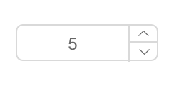
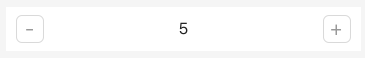
Screenshots
web:
react-native:
install

Usage
var InputNumber = require('rc-input-number');
var React = require('react');
var ReactDOM = require('react-dom');
ReactDOM.render(<InputNumber defaultValue={19}/>, container);
Development
npm install
npm start
Example
http://127.0.0.1:8000/examples/
online example: http://react-component.github.io/input-number/examples/
react-native
./node_modules/rc-tools run react-native-init
react-native run-ios
API
props
| name | type | default | description |
|---|---|---|---|
| min | Number | Specifies the minimum value | |
| onClick | |||
| placeholder | string | ||
| max | Number | Specifies the maximum value | |
| step | Number or String | 1 | Specifies the legal number intervals |
| disabled | Boolean | false | Specifies that an InputNumber should be disabled |
| focusOnUpDown | Boolean | true | whether focus input when click up or down button |
| autoFocus | Boolean | false | Specifies that an InputNumber should automatically get focus when the page loads |
| readOnly | Boolean | false | Specifies that an InputNumber is read only |
| name | String | Specifies the name of an InputNumber(`web only`) | |
| value | Number | Specifies the value of an InputNumber | |
| defaultValue | Number | Specifies the defaultValue of an InputNumber | |
| onChange | Function | Called when value of an InputNumber changed | |
| style | Object | root style. such as {width:100} | |
| styles | ReactNative StyleSheet | component's stylesheet, can use lib/styles | |
| upStyle | Object | up step wrap style. `react native only` | |
| downStyle | Object | down step style. `react native only` | |
| inputStyle | Object | input style. `react native only` | |
| upHandler | React.Node | custom the up step element | |
| downHandler | React.Node | custom the down step element | |
| formatter | Function | Specifies the format of the value presented |
Keyboard Navigation
- When you hit the ⬆ or ⬇ key, the input value will be increased or decreased by
step - With the Shift key (Shift+⬆, Shift+⬇), the input value will be changed by
10 * step - With the Ctrl or ⌘ key (Ctrl+⬆ or ⌘+⬆ or Ctrl+⬇ or ⌘+⬇ ), the input value will be changed by
0.1 * step
Test Case
npm test
npm run chrome-test
Coverage
npm run coverageopen coverage/ dir
License
rc-input-number is released under the MIT license.