
Package Exports
- react-loader-placeholder
This package does not declare an exports field, so the exports above have been automatically detected and optimized by JSPM instead. If any package subpath is missing, it is recommended to post an issue to the original package (react-loader-placeholder) to support the "exports" field. If that is not possible, create a JSPM override to customize the exports field for this package.
Readme
react-loader-placeholder
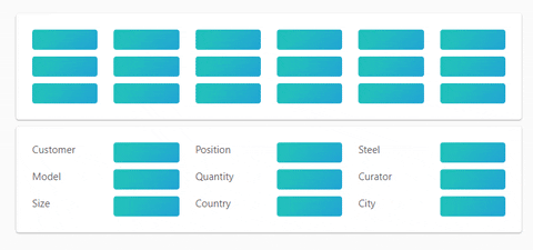
Make beautiful, animated loading that easy adapt to your app.
Install
npm install react-loader-placeholder
Principles
The <ReactLoaderPlaceholder> uses HTML data attribute for mark items and CSS for style that items.

Usage
- Wrap component or HTML with
<ReactLoaderPlaceholder>. - Set
loadingprop. - Mark HTML items with
data-react-loader-placeholder={true}attribute. - ?????
- PROFIT.
If you need to enable or disable not all marked items, just set data-react-loader-placeholder} to true or false.
##Props
The <ReactLoaderPlaceholder> component props:
- loading
booleanrequired - Enable or disable placeholder. - color
stringoptional - Background color of placeholder item. - disableAnimation
booleanoptional - Enable or disable animation. - className
stringoptional - style
Objectoptional