
Package Exports
- react-loader-placeholder
Readme
react-loader-placeholder


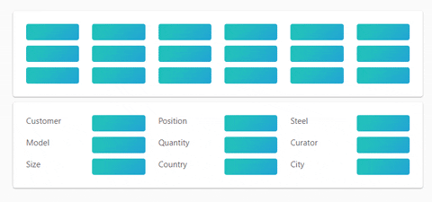
Make beautiful, animated loading that easy adapt to your app.
Install
npm install react-loader-placeholder
Principles
The <ReactLoaderPlaceholder> uses HTML data attribute for mark items and CSS for style that items.

Usage
- Wrap component or HTML with
<ReactLoaderPlaceholder>. - Set
loadingprop. - Mark HTML items with
data-react-loader-placeholder={true}attribute. - ?????
- PROFIT.
If you need to enable or disable not all marked items, just set data-react-loader-placeholder} to true or false.
##Props
The <ReactLoaderPlaceholder> component props:
- loading
booleanrequired - Enable or disable placeholder. - color
stringoptional - Background color of placeholder item. - disableAnimation
booleanoptional - Enable or disable animation. - className
stringoptional - style
Objectoptional