
Package Exports
- react-native-date-picker-x
This package does not declare an exports field, so the exports above have been automatically detected and optimized by JSPM instead. If any package subpath is missing, it is recommended to post an issue to the original package (react-native-date-picker-x) to support the "exports" field. If that is not possible, create a JSPM override to customize the exports field for this package.
Readme
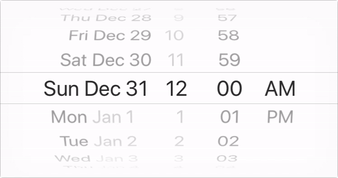
React Native Date Picker
📅 A date picker component for React Native working on iOS and Android. It uses the default DatePickerIOS on iOS and a custom picker on Android which has similar look and feel.
Installation
yarn add react-native-date-picker-x
react-native link
Usage
import React, { Component } from 'react';
import { View, StyleSheet} from 'react-native';

import DatePicker from 'react-native-date-picker-x';

export default class App extends Component {

  state = { chosenDate: new Date()}

  setDate = (newDate) => this.setState({ chosenDate: newDate })

  render() {
    return (
      <View style={styles.container}>
        <DatePicker
          date={this.state.chosenDate}
          onDateChange={this.setDate}
        />
      </View>
    );
  }
}

const styles = StyleSheet.create({
  container: {
    flex: 1,
    alignItems: 'center',
    justifyContent: 'center',
    backgroundColor: 'white',
  },
})
Goal
The goal is to make a cross platform variant of DatePickerIOS by implementing a Android variant with similar look and feel.
TODO
- Mode: datetime
- Locale support. (AM/PM, 12h/24h toggled and strings translated)
- Replace todays date with the string "Today" (considering locale)
- Animate to date when state change occur.
- Transparent background support. (Probably need to include transparent gradient).
- Align text to right.
- Mode: date
- Mode: time
- Support maximumDate/minimumDate. (Gray out and animate back to max/min value if exceeded).