
Package Exports
- react-tippy
- react-tippy/dist/tippy.css
This package does not declare an exports field, so the exports above have been automatically detected and optimized by JSPM instead. If any package subpath is missing, it is recommended to post an issue to the original package (react-tippy) to support the "exports" field. If that is not possible, create a JSPM override to customize the exports field for this package.
Readme
React Tippy
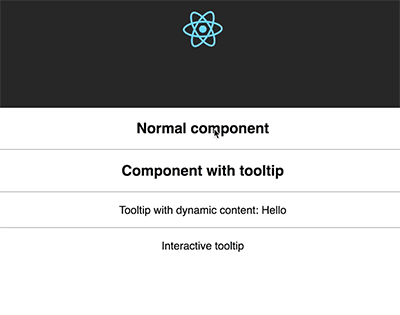
A lightweight tooltip for React. Demo at Demo page here...
Based on tippy.js and powered by Popper.js
Why you should use it?
It is designed to work friendly with React, it provides <Tooltip> element or a higher-order component
It uses React DOM to render tooltip content. Therefore, you can fully use it in your React project without doubt
It is an enhancement of Tippy.js for using in React.
Getting Started
yarn add react-tippy
How to use
First, you need import css
import 'react-tippy/dist/tippy.css'
There are 2 ways for you to use react Tippy
Tooltip Component
import {
  Tooltip,
} from 'react-tippy';


<Tooltip
  // options
  title="Welcome to React"
  position="bottom"
  trigger="click"
>
  <p>
    Click here to show popup
  </p>
</Tooltip>
High Order Component
withTooltip(Component, options)
import {
  withTooltip,
} from 'react-tippy';


const Header = () => (
  <h2>Header here</h2>
);

const HeaderWithTootip = withTooltip(Header, {
  title: 'Welcome to React with tooltip',
});
Props
| Setting | Default | Options | Role |
|---|
|disabled|false|true false|Show or not show tooltip|
|open|undefined|true false|Just only use it if you want to show/hide it manually. Usually, you don't need it|
|onRequestClose|noop function|Function|Just only use it if you want to show/hide it manually. This event is fired when you click outside of your tooltip, should be used with the prop interaction to keep your tooltip showing|
|position|top|top bottom left right|Specifies which direction to position the tooltip on the element.|
|trigger|mouseenter focus|mouseenter focus click manual|Specifies which type of events will trigger a tooltip to show. Separate each by a space. mouseenter is for hovering and touch on mobile, and focus is for keyboard navigation. Use manual if you want to show/hide the tooltip manually/programmatically (see below).|
|interactive|false|true false|Makes a tooltip interactive, i.e. will not close when the user hovers over or clicks on the tooltip. This lets you create a popover (similar to Bootstrap) when used in conjunction with a click trigger.|
|delay|0|Any integer >= 0 (milliseconds)|Specifies how long it takes after a trigger event is fired for a tooltip to show.|
|hideDelay|0|Any integer >= 0 (milliseconds)|Specifies how long it takes after a leave event is fired for a tooltip to hide. Not applicable when clicking on the document to hide tooltips.|
|animation|shift|shift perspective fade scale none|Specifies the type of transition animation a tooltip has.|
|arrow|false|true false|Adds an arrow pointing to the tooltipped element. Setting this to true disables animateFill.|
|arrowSize|regular|small regular big|Specifies how big the tooltip's arrow is.|
|animateFill|true|true false|Adds a material design-esque filling animation. This is disabled if you have arrow set to true.|
|duration|375|Any integer >= 0 (milliseconds)|Specifies how long the transition animation takes to complete when showing a tooltip.|
|hideDuration|375|Any integer >= 0 (milliseconds)|Specifies how long the transition animation takes to complete when hiding a tooltip.|
|distance|10|Any number (pixels)|Specifies how far away the tooltip is from its element.|
|offset|0|Any number (pixels)|Offsets the tooltip on its opposite axis. For position top and bottom, it acts as offsetX. For position left and right, it acts as offsetY.|
|hideOnClick|true|true false 'persistent'|Specifies whether to hide a tooltip upon clicking its element after hovering over.|
|multiple|false|true false|Specifies whether to allow multiple tooltips open on the page (click trigger only).|
|followCursor|false|true false|Specifies whether to follow the user's mouse cursor (mouse devices only).|
|inertia|false|true false|Modifies the transition-timing-function with a cubic bezier to create a "slingshot" intertial effect.|
|transitionFlip|true|true false|Specifies whether to transition between flips or not. Uses the same transition timing as duration|
|popperOptions|{}|Object|Allows more control over tooltip positioning and behavior. See right below.|
|html|null|react element|Tooltip content. If you don't define html, the title will be used|
|size|regular|small regular big|Specifies how big the tooltip is.|
|beforeShown|noop|function|Callback before show|
|shown|noop|function|Callback after show|
|beforeHidden|noop|function|Callback before hide|
|hidden|noop|function|Callback after hide|
|theme|dark|dark light transparent|The CSS styling theme.|
|className|''|string|className of container|
|style|{}|React inline style (object)|style of container|
Custom tooltip content
You need to pass element to option html
import {
  withTooltip,
} from 'react-tippy';


<Tooltip
  html={(
    <div>
      <strong>
        Hello
      </strong>
    </div>
  )}
>
  // ...
</Tooltip>
Interactive html tooltip
You can use interactive prop and html for your interactive tooltip
  <Tooltip
    trigger="click"
    interactive
    html={(
      <div>
        <p>{tooltipContent}</p>
        <input
          type="text"
          value={tooltipContent}
          onChange={(e) => {setTooltipContent(e.target.value)}}
        />
      </div>
    )}
  >
    ...
  </Tooltip>
Show/hide your tooltip manually
<Tooltip
  title={tooltipContent}
  open={open}
  onRequestClose={() => {console.log('call'); setIsOpen(false)}}
>
  <span className="App-intro" onClick={() => { setIsOpen(true) }}>
    This will show {tooltipContent}
  </span>
</Tooltip>
License
MIT. Also check Popper.js' license.