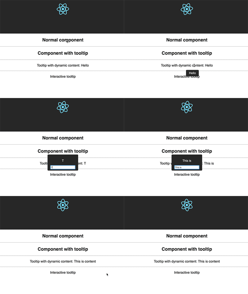
Package Exports
- react-tippy
- react-tippy/dist/tippy.css
This package does not declare an exports field, so the exports above have been automatically detected and optimized by JSPM instead. If any package subpath is missing, it is recommended to post an issue to the original package (react-tippy) to support the "exports" field. If that is not possible, create a JSPM override to customize the exports field for this package.
Readme
React Tippy
Tooltip for React, using tippy.js

Getting Started
yarn add react-tippy
How to use
First, you need import css
import 'react-tippy/dist/tippy.css'
There are 2 ways for you to use react Tippy
Tooltip Component
import {
  Tooltip,
} from 'react-tippy';


<Tooltip
  // options
  title="Welcome to React"
  position="bottom"
  trigger="click"
>
  <p className="App-intro">
    To get started, edit <code>src/App.js</code> and save to reload.
  </p>
</Tooltip>
High Order Component
withTooltip(Component, options)
import {
  withTooltip,
} from 'react-tippy';


const Header = () => (
  <h2>Welcome to React with tooltip</h2>
);

const HeaderWithTootip = withTooltip(Header, {
  title: 'Welcome to React with tooltip',
});
Options
| Settingsettings | Defaultremove | Optionssettings_input_component | Rolebuild |
|---|---|---|---|
| position | 'top' | 'top' 'bottom' 'left' 'right' | Specifies which direction to position the tooltip on the element. |
| trigger | 'mouseenter focus' | 'mouseenter' 'focus' 'click' 'manual' | Specifies which type of events will trigger a tooltip to show. Separate each by a space. mouseenter is for hovering and touch on mobile, and focus is for keyboard navigation. Use manual if you want to show/hide the tooltip manually/programmatically (see below). |
| interactive | false | true false | Makes a tooltip interactive, i.e. will not close when the user hovers over or clicks on the tooltip. This lets you create a popover (similar to Bootstrap) when used in conjunction with a click trigger. |
| delay | 0 | Any integer >= 0 (milliseconds) | Specifies how long it takes after a trigger event is fired for a tooltip to show. |
| hideDelay | 0 | Any integer >= 0 (milliseconds) | Specifies how long it takes after a leave event is fired for a tooltip to hide. Not applicable when clicking on the document to hide tooltips. |
| animation | 'shift' | 'shift' 'perspective' 'fade' 'scale' 'none' | Specifies the type of transition animation a tooltip has. |
| arrow | false | true false | Adds an arrow pointing to the tooltipped element. Setting this to true disables animateFill. |
| animateFill | true | true false | Adds a material design-esque filling animation. This is disabled if you have arrow set to true. |
| duration | 400 | Any integer >= 0 (milliseconds) | Specifies how long the transition animation takes to complete when showing a tooltip. |
| hideDuration | duration | Any integer >= 0 (milliseconds) | Specifies how long the transition animation takes to complete when hiding a tooltip. |
| html | false | false or a template id | Allows you to add HTML to a tooltip. See Creating HTML templates. |
| theme | 'dark' | 'dark' 'light' | The CSS styling theme. You can add your own easily. See Creating themes. |
| offset | 0 | Any number (pixels) | Offsets the tooltip on its opposite axis. For position top and bottom, it acts as offsetX. For position left and right, it acts as offsetY. |
| hideOnClick | true | true false | Specifies whether to hide a tooltip upon clicking its element after hovering over. |
| multiple | false | true false | Specifies whether to allow multiple tooltips open on the page (click trigger only). |
| followCursor | false | true false | Specifies whether to follow the user's mouse cursor (mouse devices only). |
| inertia | false | true false | Modifies the transition-timing-function with a cubic bezier to create a "slingshot" intertial effect. |
| popperOptions | {} | Object | Allows more control over tooltip positioning and behavior. See right below. |