
Package Exports
- rmc-list-view
- rmc-list-view/es/ListViewDataSource
- rmc-list-view/es/ScrollView
This package does not declare an exports field, so the exports above have been automatically detected and optimized by JSPM instead. If any package subpath is missing, it is recommended to post an issue to the original package (rmc-list-view) to support the "exports" field. If that is not possible, create a JSPM override to customize the exports field for this package.
Readme
rmc-list-view
React ListView Component, port from React Native ListView


port from React Native ListView (v0.26)
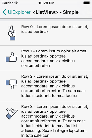
Screenshots
Development
npm install
npm start
Example
http://localhost:8999/examples/
online example: http://react-component.github.io/m-list-view/
install

Usage
see examples
API
| Properties | Descrition | Type | Default |
|---|---|---|---|
| dataSource | An instance of ListView.DataSource to use | ListViewDataSource | - |
| initialListSize | How many rows to render on initial component mount. | number | - |
| onEndReached | Called when all rows have been rendered and the list has been scrolled to within onEndReachedThreshold of the bottom. |
(event?) => {} | - |
| onEndReachedThreshold | Threshold in pixels (virtual, not physical) for calling onEndReached. |
number | 1000 |
| pageSize | Number of rows to render per event loop. | number | 1 |
| renderHeader / renderFooter | The header and footer are always rendered (if these props are provided) on every render pass. If they are expensive to re-render, wrap them in StaticContainer or other mechanism as appropriate. Footer is always at the bottom of the list, and header at the top, on every render pass. | () => renderable | - |
| renderRow | Takes a data entry from the data source and its ids and should return a renderable component to be rendered as the row. By default the data is exactly what was put into the data source, but it's also possible to provide custom extractors. ListView can be notified when a row is being highlighted by calling highlightRow function. | (rowData, sectionID, rowID, highlightRow) => renderable | - |
| renderScrollComponent | A function that returns the scrollable component in which the list rows are rendered. Defaults to returning a ScrollView with the given props. (if you set renderScrollComponent, |
||
you need to write your own scroll logic like ScrollView component(see /examples/MyScroller.js)) |
(props) => renderable | - | |
| renderSectionHeader | If provided, a header is rendered for this section. | (sectionData, sectionID) => renderable | - |
| renderSeparator | If provided, a renderable component to be rendered as the separator below each row but not the last row if there is a section header below. Take a sectionID and rowID of the row above and whether its adjacent row is highlighted. | (sectionID, rowID, adjacentRowHighlighted) => renderable | - |
| scrollRenderAheadDistance | How early to start rendering rows before they come on screen, in pixels. | number | 1000 |
| contentContainerStyle | These styles will be applied to the scroll view content container which wraps all of the child views. | Object | - |
| horizontal | When true, the scroll view's children are arranged horizontally in a row instead of vertically in a column. | bool | false |
| onContentSizeChange | Called when scrollable content view of the ScrollView changes. | (contentWidth, contentHeight) => {} | - |
| onScroll | Fires at most once per frame during scrolling. The frequency of the events can be controlled using the scrollEventThrottle prop. |
e => {} | - |
| scrollEventThrottle | This controls how often the scroll event will be fired while scrolling | number | 50 |
| refreshControl | A RefreshControl component, used to provide pull-to-refresh functionality for the ScrollView. | element | - |
| onLayout | Invoked on mount and layout changes with | ({nativeEvent:{ layout:{ width, height }}}) => {} | - |
| ---- | |||
| renderBodyComponent | render listview body wrapper component | () => renderable | - |
| renderSectionBodyWrapper | render listview section body wrapper component | (sectionID) => renderable | - |
| useBodyScroll | use html body's scroll |
bool | false |
| useZscroller | use zscroller to well support RefreshControl(useBodyScroll and sticky not work when enable useZscroller) |
bool | false |
| scrollerOptions | zscroller options | Object | - |
| stickyHeader | if set it, auto enable useBodyScroll and you can also set stickyProps / stickyContainerProps (see react-sticky) |
bool | false |
方法
- getMetrics() - Exports some data, e.g. for perf investigations or analytics.
- scrollTo(...args) - Scrolls to a given x, y offset(not support smooth animation).
ListView.IndexedList
Note: You can use almost all APIs on the ListView, except for useZscroller
| Properties | Descrition | Type | Default |
|---|---|---|---|
| quickSearchBarTop | top button object | object{value:string, label:string} | { value: '#', label: '#' } |
| quickSearchBarStyle | quickSearchBar's style | object | - |
| onQuickSearch | callback on click quick searchbar | (sectionID) => {} | - |
| showQuickSearchIndicator | whether show quick search indicator | bool | false |
| delayTime | delay render time (delay render these items of totalRowCount - initialListSize) |
number | 100ms |
| delayActivityIndicator | delay render activity indicator | react node | - |
ListView.RefreshControl
| Properties | Descrition | Type | Default |
|---|---|---|---|
| icon | refresh indicator, include pull and release state |
react node | - |
| loading | loading indicator | react node | - |
| distanceToRefresh | distance to refresh | number | 50 |
| onRefresh | required, onRefresh callback | () => {} | - |
| refreshing | whether to show refreshing state | bool | false |
Test Case
npm testCoverage
npm run coverageopen coverage/ dir
License
rmc-list-view is released under the MIT license.