
Package Exports
- toolcool-range-slider
- toolcool-range-slider/dist/toolcool-range-slider.min.js
This package does not declare an exports field, so the exports above have been automatically detected and optimized by JSPM instead. If any package subpath is missing, it is recommended to post an issue to the original package (toolcool-range-slider) to support the "exports" field. If that is not possible, create a JSPM override to customize the exports field for this package.
Readme
Tool Cool Range Slider


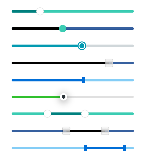


Responsive range slider library written in typescript and using web component technologies. Pure JavaScript without additional dependencies. It has a rich set of settings, including one and two pointers, a vertical slider, touch, mousewheel and keyboard support, local and session storage, range dragging, and RTL support.
- Responsive, touch, mousewheel, and keyboard support 📱
- Range slider with one or two pointers.
- Accessible via ARIA-attributes 🛡️
- ES6 JavaScript + TypeScript.
- No dependencies 🔓
- Predefined themes (optional) 🎨
- Images and SVG can be used as pointers.
- Customizable with a large set of style attributes 🔧
- Horizontal and vertical sliders support.
- Based on web component technologies.
- Allows programmatic attribute changes 💻
- Bottom to top support.
- Simple dynamic rendering after ajax requests or delays.
- Disabled / enabled range slider (including API).
- Possibility to disable only one pointer.
- Local storage and session storage support 💾
- Supports a list of individual values (discrete values).
- Right to left (RTL) support 🌐
- Text data support ✍️
- Non-linear range slider 📉
- Optional animation on panel click.
- Works well with Bootstrap and other CSS frameworks 👍
- No CSS conflicts due to web components.
- Automatically generated labels (optional).
- Supports multiple sliders on one page.
- Supports two pointers overlap, pointers max and min distance.
- Supports range dragging.
Table of contents
- Basic usage
- CDN
- Node.js usage
- Main Properties
- List of individual values and text data
- Width, Height, and Border Radius
- Automatically generated labels
- Predefined Styles (Themes)
- CSS Links
- Images and SVGs as pointers
- Colors
- Vertical Slider
- Pointer Shapes
- Touch & Keyboard Support
- Events
- Disabled range slider or one pointer
- Storage
- RTL Support
- Accessibility via ARIA-attributes
- Non-linear step
- Pointers overlap
- Pointers max and min distance
- Animation on panel click
- Range dragging
- Soft limits
- Generating slider dynamically
- TypeScript Usage
- Usage with React and TypeScript
- License
Basic Usage
Download the latest toolcool-range-slider.min.js script:
Add the following html to the page:
<toolcool-range-slider></toolcool-range-slider>

<script type="text/javascript" src="toolcool-range-slider.min.js"></script>
Or alternatively:
<tc-range-slider></tc-range-slider>

<script type="text/javascript" src="toolcool-range-slider.min.js"></script>
You can control the range slider by referencing the toolcool-range-slider HTML tag.
<toolcool-range-slider id="slider-1"></toolcool-range-slider>

<script type="text/javascript" src="toolcool-range-slider.min.js"></script>

<script>
    // get the reference
    const $slider = document.getElementById('slider-1');

    // change value
    $slider.value = 50;

    // or
    // $slider.setAttribute('value', '50');

    // get value
    console.log($slider.value);

    // listen to the change event
    $slider.addEventListener('change', (evt) => {
      const value = Math.round(evt.detail.value);
      console.log(value);
    });
</script>
The value label can also be automatically bound using the value-label attribute:
<toolcool-range-slider value-label=".value-1"></toolcool-range-slider>

<div class="value-1"></div>

<script type="text/javascript" src="toolcool-range-slider.min.js"></script>
Range slider with two pointers can be created by adding the value2 parameter:
<toolcool-range-slider min="0" max="100" value="30" value2="60"></toolcool-range-slider>It's also possible to use value1 instead of value:
<toolcool-range-slider min="0" max="100" value1="30" value2="60"></toolcool-range-slider>value1 is just an alias of the value property.
Two pointers range slider API example:
<toolcool-range-slider id="slider-1" value1="10" value2="50"></toolcool-range-slider>

<script type="text/javascript" src="toolcool-range-slider.min.js"></script>

<script>
    // get the reference
    const $slider = document.getElementById('slider-1');

    // change values
    $slider.value = 60;
    $slider.value2 = 70;

    // or
    // $slider.setAttribute('value', '60');
    // $slider.setAttribute('value2', '70');

    // get values
    console.log($slider.value);
    console.log($slider.value2);

    // listen to the change event
    $slider.addEventListener('change', (evt) => {
      console.log(evt.detail.value);
      console.log(evt.detail.value2);
    });
</script>
⭐ It's also possible to generate min, max, and value labels automatically. Click here for more details.
📌 More examples with automatic label binding can be found here.
📌 Examples with js binding can be found here.
CDN
The ToolCool Range Slider is also available in the jsDelivr CND:
<toolcool-range-slider></toolcool-range-slider>

<script type="text/javascript" src="https://cdn.jsdelivr.net/npm/toolcool-range-slider/dist/toolcool-range-slider.min.js"></script>
Node.js usage
Range slider may also be included as a node module using npm:
npm i toolcool-range-slider
or with Yarn:
yarn add toolcool-range-slider
And then you can include it in your application like this:
import 'toolcool-range-slider';NPM package can fe found here.
Main Properties
Range slider has the following main properties: min, max, value, value1, value2, and step. All properties are optional, including step. Usage examples:
<toolcool-range-slider></toolcool-range-slider>

<toolcool-range-slider min="10" max="50"></toolcool-range-slider>

<toolcool-range-slider min="-100" max="100" value="50"></toolcool-range-slider>

<toolcool-range-slider min="0" max="100" value="50"></toolcool-range-slider>

<toolcool-range-slider min="100" max="200" value="150" step="10" round="0"></toolcool-range-slider>

<toolcool-range-slider value1="10" value2="20"></toolcool-range-slider>

<toolcool-range-slider min="-200" max="200" value1="-50" value2="100"></toolcool-range-slider>
The properties have the following default values:
| Property | Default Value | Description |
|---|---|---|
| min | 0 | The minimum value. |
| max | 100 | The maximum value. |
| value | 0 | Current slider value. |
| value1 | 0 | Alias for the value property (used in a slider with two pointers). |
| value2 | undefined | Second pointer value. |
| step | undefined | Slide step. |
| round | 2 | The maximum number of decimal places. |
📌 If no value is specified, it will be equal to the minimum value.
📌 To create a 2 pointer range slider, specify value1 and value2.
Each property can also be changed programmatically:
<toolcool-range-slider id="slider-1"></toolcool-range-slider>

<script type="text/javascript" src="toolcool-range-slider.min.js"></script>

<script>
    // get the reference
    const $slider = document.getElementById('slider-1');

    // set properties
    $slider.min = -200;
    $slider.max = 200;
    $slider.value = 50; // or $slider.value1 = 50;
    $slider.value2 = 150;
    $slider.step = 10;
    $slider.round = 0;

    // or
    // $slider.setAttribute('min', '-200');
    // ...
</script>
List of individual values and text data
It is also possible (but not required) to provide a list of numeric or text data instead of min and max properties.
ABC example:
<toolcool-range-slider
  data="a, b, c, d, e, f, g, h, i, j, k, l, m, n, o, p, q, r, s, t, u, v, w, x, y, z"></toolcool-range-slider>
Geometric progression:
<toolcool-range-slider
data="2, 4, 8, 16, 32, 64, 128, 256, 512, 1024, 2048, 4096, 8192"></toolcool-range-slider>
In the case where numeric and textual data is mixed, we assume that all data is textual.
It's also possible to define / change data via API:
<toolcool-range-slider id="slider-1"></toolcool-range-slider>

<script type="text/javascript" src="toolcool-range-slider.min.js"></script>

<script>
    // get the reference
    const $slider = document.getElementById('slider-1');

    // change data
    $slider.data = [10, 20, 30];

    // or

    $slider.data = ['red', 'green', 'blue'];

    // or
    // $slider.setAttribute('data', '10, 20, 30');
</script>
📌 Example page can be found here.
Width, Height, and Border Radius
By default, the slider width is 100% and the height is 0.25 rem. These values can be changed using the slider-width and slider-height properties:
<toolcool-range-slider
        slider-width="300px"
        slider-height="15px"
        slider-radius="0.5rem"></toolcool-range-slider>

<toolcool-range-slider
       slider-width="100%"
       slider-height="1rem"></toolcool-range-slider>
Pointer width, height, and border-radius can be change using pointer-width, pointer-height, and pointer-radius properties:
<toolcool-range-slider
        pointer-width="35px"
        pointer-height="35px"
        pointer-radius="5px"></toolcool-range-slider>

<toolcool-range-slider
        value1="30"
        value2="60"
        pointer-width="35px"
        pointer-height="35px"
        pointer-radius="5px"></toolcool-range-slider>
It's also possible to make different styles for the second pointer:
<toolcool-range-slider
        value1="30"
        value2="60"
        pointer-width="35px"
        pointer-height="35px"
        pointer-radius="5px"

        pointer2-width="45px"
        pointer2-height="45px"
        pointer2-radius="10px"></toolcool-range-slider>
Default values table:
| HTML Property | Default Value | API Property |
|---|---|---|
| slider-width | 300px | sliderWidth |
| slider-height | 0.25rem | sliderHeight |
| slider-radius | 1rem | sliderRadius |
| pointer-width | 1rem | pointerWidth |
| pointer-height | 1rem | pointerHeight |
| pointer-radius | 100% | pointerRadius |
| pointer2-width | inherits pointer-width | pointerWidth |
| pointer2-height | inherits pointer-height | pointerHeight |
| pointer2-radius | inherits pointer-radius | pointerRadius |
Each property can also be changed via the API:
<toolcool-range-slider id="slider-1" value1="30" value2-60></toolcool-range-slider>

<script type="text/javascript" src="toolcool-range-slider.min.js"></script>

<script>
    // get the reference
    const $slider = document.getElementById('slider-1');

    // change properties
    $slider.sliderWidth = '300px';
    $slider.sliderHeight = '1rem';
    $slider.sliderRadius = 0;

    $slider.pointerWidth = '1rem';
    $slider.pointerHeight = '1rem';
    $slider.pointerRadius = '100%';

    $slider.pointer2Width = '2rem';
    $slider.pointer2Height = '2rem';
    $slider.pointer2Radius = '0';

    // or
    // $slider.setAttribute('sliderWidth', '300px');
    // ...
</script>
Automatically generated labels
It's possible to generate min, max, and value labels automatically using generate-labels="true" attribute:
<toolcool-range-slider generate-labels="true"></toolcool-range-slider>If this attribute is specified, the minimum, maximum, and value label are automatically generated.
You can provide custom html for all or part of the labels:
<toolcool-range-slider generate-labels="true">
  <div slot="min-label"><label class="min-label"></label> px</div>
  <div slot="max-label"><label class="max-label"></label> px</div>
  <div slot="value-label"><label class="value-label"></label> px</div>
</toolcool-range-slider>
In case of 2 pointers range slider value2-label slot and label should be added:
<toolcool-range-slider generate-labels="true">
  <div slot="min-label"><label class="min-label"></label> px</div>
  <div slot="max-label"><label class="max-label"></label> px</div>
  <div slot="value-label"><label class="value-label"></label> px</div>
  <div slot="value2-label"><label class="value2-label"></label> px</div>
</toolcool-range-slider>
This way you can add CSS classes, inline styles, or any HTML structure instead of the standard range slider labels.
❗ Please make sure you keep slot names with one of the following values: min-label, max-label, value-label, value2-label.
❗ It's also important, that the labels have one of the following classes: min-label, max-label, value-label, value2-label. These classes are used as placeholders for min, max, and value (value1), value2.
Other than that, the HTML structure can be changed in any way.
It is also possible to enable or disable generated labels programmatically:
<toolcool-range-slider id="slider-1"></toolcool-range-slider>

<script type="text/javascript" src="toolcool-range-slider.min.js"></script>

<script>
    // get the reference
    const $slider = document.getElementById('slider-1');

    // change the setting
    $slider.generateLabels = true; // or false

    // or
    // $slider.setAttribute('generateLabels', 'true');
</script>
📌 Example page can be found here.
Predefined Styles (Themes)

The slider has several optional predefined themes. Each theme defines a unique look-and-feel and can be used "as is" without defining each style parameter separately.
All themes are fully optional and can be partially or completely replaced by custom styles, as described later in this documentation.
The slider has the following themes:
| Theme Code Name | Example |
|---|---|
| target | Example 1, Example 2 |
| glass | Example 1, Example 2 |
| rect | Example 1, Example 2 |
| circle | Example 1, Example 2 |
| gradient | Example |
| ruler | Example |
Usage examples:
<toolcool-range-slider
  slider-width="400px"
  slider-height="0.5rem"
  theme="rect"></toolcool-range-slider>
It's possible to combine themes together with custom properties like this:
 <toolcool-range-slider
  slider-width="400px"
  slider-height="0.5rem"
  theme="rect"
  slider-bg="red"></toolcool-range-slider>
API:
<toolcool-range-slider id="slider-1"></toolcool-range-slider>
<script type="text/javascript" src="toolcool-range-slider.min.js"></script>

<script>
    // get the reference
    const $slider = document.getElementById('slider-1');

    // change theme
    $slider.theme = 'rect';

    // or
    // $slider.setAttribute('theme', 'rect');
</script>
CSS Links
It's possible to provide the paths to CSS files using css-links attribute as follows:
<toolcool-range-slider css-links="test-1.css"></toolcool-range-slider>You can add more than one path by separating them with ;
<toolcool-range-slider css-links="test-1.css; test-2.css;"></toolcool-range-slider>The priority of loaded CSS rules will be higher than web component attributes.
📌 Example page can be found here.
Images and SVGs as pointers
Images and SVG can be used as pointers using pointer-bg, pointer-bg-hover, and pointer-bg-focus attributes, like this:
<toolcool-range-slider
  min="0"
  max="100"
  value1="50"
  value2="60"

  slider-width="400px"
  slider-height="0.5rem"

  pointer-width="1.5rem"
  pointer-height="1.5rem"

  slider-bg="#6AD3BA"
  slider-bg-hover="#3F8A8A"
  slider-bg-fill="#378c8a"

  pointer-bg="#fff url(image.png) no-repeat 50% 50%"
  pointer-bg-hover="#c6f7eb url(image.png) no-repeat 50% 50%"
  pointer-bg-focus="#c6f7eb url(image.png) no-repeat 50% 50%">
</toolcool-range-slider>
📌 Example page can be found here.
Colors
Color and other styles can be customized with the following attributes:
<toolcool-range-slider
        slider-width="400px"
        slider-height="0.5rem"
        pointer-width="1.5rem"
        pointer-height="1.5rem"
        slider-bg="#6AD3BA"
        slider-bg-hover="#3F8A8A"
        pointer-border-hover="1px solid #79D6C0"
        pointer-border-focus="1px solid #79D6C0"></toolcool-range-slider>


<toolcool-range-slider
          slider-width="400px"
          slider-height="0.5rem"
          pointer-width="1.5rem"
          pointer-height="1.5rem"
          pointer-bg="#6AD3BA"
          pointer-bg-hover="#50BDA3"
          pointer-shadow="none"
          pointer-shadow-hover="none"
          pointer-border="0"
          pointer-border-hover="1px solid #3F8A8A"
          pointer-border-focus="1px solid #3F8A8A"></toolcool-range-slider>
The list of attributes and default values:
| HTML Attribute | Default Value | API Property |
|---|---|---|
| slider-bg | #4d69ad | sliderBg |
| slider-bg-hover | #5f79b7 | sliderBgHover |
| slider-bg-fill | #000 | sliderBgFill |
| pointer-bg | #fff | pointerBg |
| pointer-bg-hover | #dcdcdc | pointerBgHover |
| pointer-bg-focus | #dcdcdc | pointerBgFocus |
| pointer-shadow | 0 0 2px rgba(0, 0, 0, 0.6) | pointerShadow |
| pointer-shadow-hover | 0 0 2px rgb(0, 0, 0) | pointerShadowHover |
| pointer-shadow-focus | 0 0 2px rgb(0, 0, 0) | pointerShadowFocus |
| pointer-border | 1px solid hsla(0, 0%, 88%, 0.5) | pointerBorder |
| pointer-border-hover | 1px solid hsla(0, 0%, 88%, 0.5) | pointerBorderHover |
| pointer-border-focus | 1px solid hsl(201, 72%, 59%) | pointerBorderFocus |
| pointer2-bg | inherits from pointer1 | pointerBg |
| pointer2-bg-hover | inherits from pointer1 | pointerBgHover |
| pointer2-bg-focus | inherits from pointer1 | pointerBgFocus |
| pointer2-shadow | inherits from pointer1 | pointerShadow |
| pointer2-shadow-hover | inherits from pointer1 | pointerShadowHover |
| pointer2-shadow-focus | inherits from pointer1 | pointerShadowFocus |
| pointer2-border | inherits from pointer1 ) | pointerBorder |
| pointer2-border-hover | inherits from pointer1 | pointerBorderHover |
| pointer2-border-focus | inherits from pointer1 | pointerBorderFocus |
API:
<toolcool-range-slider id="slider-1"></toolcool-range-slider>
<script type="text/javascript" src="toolcool-range-slider.min.js"></script>

<script>
    // get the reference
    const $slider = document.getElementById('slider-1');

    // change properties
    $slider.sliderBg = '#efefef';
    $slider.sliderBgHover = '#ddd';
    $slider.sliderBgFill = '#ccc';

    $slider.pointerBg = '#6AD3BA';
    $slider.pointerBgHover = '#6AD3BA';
    $slider.pointerBgFocus = '#6AD3BA';

    $slider.pointerShadow = 'none';
    $slider.pointerShadowHover = 'none';
    $slider.pointerShadowFocus = 'none';

    $slider.pointerBorder = '1px solid #3F8A8A';
    $slider.pointerBorderHover = '1px solid #3F8A8A';
    $slider.pointerBorderFocus = '1px solid #3F8A8A';

    // or
    // $slider.setAttribute('sliderBg', '#efefef');
    // ...
</script>
📌 An example of a customized slider on a dark background:

Vertical Slider

Vertical slider can be achieved using the type attribute as following:
<toolcool-range-slider type="vertical"></toolcool-range-slider>It accepts all the same attributes as the horizontal slider. The default height of a vertical slider is 300px unless the height attribute is provided.
It is also possible to reverse the direction and slide from bottom to top using the btt attribute:
<toolcool-range-slider type="vertical" btt="true"></toolcool-range-slider>Enable or disable via API:
const $slider = document.querySelector('#slider');
$slider.type = 'vertical'; // or horizontal
$slider.btt = true; // or false
Pointer Shapes

There are also several predefined pointer shapes that can be defined using the pointer-shape attribute. For example, triangle pointer shape:
<toolcool-range-slider
  min="0"
  max="100"
  value="10"
  pointer-shape="triangle"
  pointer-width="2rem"
  pointer-height="2rem"
  pointer-bg="#d7067d"
  pointer-bg-hover="#0b94c7"
  pointer-bg-focus="#0b94c7"
  slider-width="400px"
  slider-bg="#6787cd"></toolcool-range-slider>
It's also possible to define a different shape for the second pointer:
<toolcool-range-slider
  min="0"
  max="100"
  value="10"

  pointer-shape="triangle"
  pointer2-shape="star"

  pointer-width="2rem"
  pointer-height="2rem"
  pointer-bg="#d7067d"
  pointer-bg-hover="#0b94c7"
  pointer-bg-focus="#0b94c7"
  slider-width="400px"
  slider-bg="#6787cd"></toolcool-range-slider>
There are the following pointer shapes:
| Property |
|---|
| triangle |
| star |
| rhombus |
| trapezoid |
| parallelogram |
| right-arrow |
Change via API:
const $slider = document.querySelector('#slider');
$slider.pointerShape = 'rhombus';
Touch & Keyboard Support
The library supports touch screens and also handles the following keys:
Horizontal slider:
| Key | Function |
|---|---|
| left arrow | goes one step to the left |
| right arrow | goes one step to the right |
| up arrow | jumps to the min value |
| down arrow | jumps to the max value |
| mousewheel up | goes one step to the left |
| mousewheel down | goes one step to the right |
Horizontal slider in right-to-left mode:
| Key | Function |
|---|---|
| left arrow | goes one step to the left |
| right arrow | goes one step to the right |
| up arrow | jumps to the max value |
| down arrow | jumps to the min value |
| mousewheel up | goes one step to the left |
| mousewheel down | goes one step to the right |
Vertical slider:
| Key | Function |
|---|---|
| left arrow | jumps to the min value |
| right arrow | jumps to the max value |
| up arrow | goes one step up |
| down arrow | goes one step down |
| mousewheel up | goes one step up |
| mousewheel down | goes one step down |
Vertical slider in bottom-to-top mode:
| Key | Function |
|---|---|
| left arrow | jumps to the max value |
| right arrow | jumps to the min value |
| up arrow | goes one step up |
| down arrow | goes one step down |
| mousewheel up | goes one step up |
| mousewheel down | goes one step down |
It's possible to disable keyboard support with keyboard-disabled attribute:
<toolcool-range-slider keyboard-disabled="true"></toolcool-range-slider>Or via API:
const $slider1 = document.getElementById('slider-1');
$slider1.keyboardDisabled = true;
Events
The range slider has the following events:
| Event | Description |
|---|---|
| change | it is sent every time the value of the range slider changes |
| onMouseDown | the native browser mousedown event |
| onMouseUp | the native browser mouseup event |
| onPointerClicked | it is dispatched when the user clicks the range slide pointer (handler) |
| onKeyDown | the native browser keydown event (arrow left, arrow right, arrow up, arrow down) |
Usage examples:
const $slider1 = document.getElementById('slider-1');

// change event ------------
$slider1.addEventListener('change', (evt) => {
    const value = Math.round(evt.detail.value);
    $value1.textContent = value.toString();
    console.log(`Change event: ${ value }`)
});

// onMouseDown event ------------
$slider1.addEventListener('onMouseDown', (evt) => {
    const nativeEvent = evt.detail.nativeEvent;
    console.log('Native mousedown event:', nativeEvent)
});

// onMouseUp event ------------
$slider1.addEventListener('onMouseUp', (evt) => {
    const nativeEvent = evt.detail.nativeEvent;
    console.log('Native mouseup event:', nativeEvent);
});

// onPointerClicked event ------------
$slider1.addEventListener('onPointerClicked', (evt) => {
    const $pointer = evt.detail.$pointer;
    console.log('Pointer clicked event:', $pointer);
});

// onKeyDownEvent event ------------
$slider1.addEventListener('onKeyDown', (evt) => {
    const nativeEvent = evt.detail.nativeEvent;
    console.log('Native onKeyDown event:', nativeEvent);
});
In the case of 2 pointers range slider, change event has value and value2 properties:
const $slider1 = document.getElementById('slider-1');

// change event ------------
$slider1.addEventListener('change', (evt) => {
    console.log(evt.detail.value);
    console.log(evt.detail.value2);
});
📌 The page with these examples can be found here.
Disabled range slider or one pointer
It's possible to disable the range slider using disabled attribute:
<toolcool-range-slider disabled="true"></toolcool-range-slider>This property can be easily toggled via APIs as follows:
const $slider1 = document.getElementById('slider-1');
const $toggleButton = document.getElementById('toggle-btn');

$toggleButton.addEventListener('click', () => {
  $slider1.disabled = !$slider1.disabled;
});
The default opacity of the range slider when disabled is 0.4. This value can be change using css variable --tc-range-slider-opacity:
<toolcool-range-slider
  disabled="true"
  style="--tc-range-slider-opacity: 0.1"></toolcool-range-slider>
📌 The page with this example can be found here.
It's also possible to disable only one pointer:
<toolcool-range-slider pointer1-disabled="true" value1="10" value2="20"></toolcool-range-slider>
<toolcool-range-slider pointer2-disabled="true" value1="10" value2="20"></toolcool-range-slider>
Or using API:
const $slider1 = document.getElementById('slider-1');
$slider1.pointer1Disabled = true;
$slider1.pointer2Disabled = true;
Storage
The range slider library also supports local and session storage. It's used to save the selected slider value between different pages and page reloads.
<toolcool-range-slider storage="session-storage" storage-key="tc-range-slider-1"></toolcool-range-slider>
<toolcool-range-slider storage="local-storage" storage-key="tc-range-slider-2"></toolcool-range-slider>
The difference between local and session storage is that session storage keeps the value only during the current session, while the local storage keeps it until the user clears the browser cache.
In case of 2 pointers range slider, the second key will have -2 suffix. For example, if storage-key="test", then the value2 key will be "test-2".
Change via API:
const $slider = document.querySelector('#slider');
$slider.storage = 'local-storage'; // 'session-storage'
$slider.storageKey = 'storage-key';

console.log($slider.storage); // 'local-storage'
console.log($slider.storageKey); // 'storage-key';
console.log($slider.storageKey2); // 'storage-key-2';
📌 The page with examples can be found here.
RTL support
The range slider also supports right to left (RTL) using rtl attribute as follows:
<toolcool-range-slider rtl="true"></toolcool-range-slider><toolcool-range-slider
slider-width="100%"
generate-labels="true"
rtl="true"></toolcool-range-slider>Enable or disable via API:
const $slider = document.querySelector('#slider');
$slider.rtl = true; // or false
📌 The page with examples can be found here.
Accessibility via ARIA-attributes
The range slider has the following accessibility attributes for each pointer:
| Attribute | Value |
|---|---|
| role | slider |
| aria-orientation | vertical or horizontal |
| aria-valuemin | minimum value for this pointer |
| aria-valuemax | maximum value for this pointer |
| aria-valuenow | the current pointer value |
| aria-valuetext | the current pointer value |
It's also possible to provide aria-label properties using aria-label1 and aria-label2 attributes:
<toolcool-range-slider value1="10" value2="30" aria-label1="lower" aria-label2="upper"></toolcool-range-slider>Or using API:
const $slider = document.querySelector('#slider');
$slider.ariaLabel1 = 'lower';
$slider.ariaLabel2 = 'upper';
Non-linear step
The range slider supports the non-linear step function. For example, the slider below has a step of 5 if the value is less than 50, otherwise the step is 10:
<toolcool-range-slider id="slider-1"></toolcool-range-slider>

<script src="toolcool-range-slider.min.js"></script>
<script>
    const $slider = document.getElementById('slider-1');
    $slider.step = (value, percent) => {
        return percent < 50 ? 5 : 10;
    };
</script>
Step function has the following type:
(value: number | string) => numberIt gets the value of the slider and returns the corresponding step value.
📌 The page with examples can be found here.
Pointers overlap
In the two pointer range slider, pointer overlap can be enabled using pointers-overlap attribute:
<toolcool-range-slider pointers-overlap="true" value1="10" value2="40" min="0" max="100"></toolcool-range-slider>There is also a corresponding API property:
const $slider = document.querySelector('#slider');
$slider.pointersOverlap = true;
Pointers max and min distance
In the two pointer range slider, it's possible to define the minimum required distance between the pointers using pointers-min-distance attribute:
<toolcool-range-slider
  generate-labels="true"
  round="0"
  value1="30"
  value2="60"
  pointers-min-distance="4"
  slider-width="100%"></toolcool-range-slider>
It is also possible to define the maximum distance between two pointers using the pointers-max-distance attribute:
<toolcool-range-slider
  generate-labels="true"
  round="0"
  value1="30"
  value2="60"
  pointers-max-distance="50"
  slider-width="100%"></toolcool-range-slider>
There is also a corresponding API properties:
const $slider = document.querySelector('#slider');
$slider.pointersMinDistance = 5;
$slider.pointersMaxDistance = 50;
Please note that the provided distances should be >= 0;
These properties (pointers-min-distance and pointers-max-distance) have no effect is pointers overlap is enabled.
The properties have the following default values:
| Property | Default Value | API Property |
|---|---|---|
| pointers-max-distance | 0 | pointersMinDistance |
| pointers-max-distance | Infinity | pointersMaxDistance |
📌 The page with examples can be found here.
Animation on panel click
It's possible to enable animation on panel click with the animate-onclick property:
<toolcool-range-slider animate-onclick="0.3s"></toolcool-range-slider>The value of the animate-onclick property is specified in seconds, ms, etc. and is the same as the css transition-duration property.
There is also a corresponding API:
const $slider = document.querySelector('#slider');
$slider.animateOnClick = '0.3s';

// or

$slider.animateOnClick = undefined; // disable
📌 The page with example can be found here.
Range dragging
It's possible to enable range dragging for a 2-pointer slider using the range-dragging property:
<toolcool-range-slider range-dragging="true"></toolcool-range-slider>There is also a corresponding API:
const $slider = document.querySelector('#slider');
$slider.rangeDragging = true; // or false
📌 The page with example can be found here.
Soft limits
It's possible to enable soft limits to the range slider. This means that the edges of the slider are disabled, for example, if the value of the slider is less than 20 or greater than 80, then the slider value is reset:
<toolcool-range-slider
  id="slider"
  animate-onclick="0.3s"
  generate-labels="true"
  round="0"
  value="30"
  value2="60"
  slider-width="100%"
  slider-height="7px"></toolcool-range-slider>

<script src="toolcool-range-slider.min.js"></script>
<script>
  const $slider = document.getElementById('slider');

  $slider.addEventListener('mouseup', (evt) => {
    if($slider.value < 20) {
      $slider.value = 20;
    }

    if($slider.value2 > 80) {
      $slider.value2 = 80;
    }
  });
</script>
📌 The page with this example can be found here.
Generating slider dynamically
The slider can be created dynamically as follows:
<div class="wrapper" id="wrapper"></div>

<script src="js/toolcool-range-slider.min.js"></script>

<script>
  const $wrapper = document.getElementById('wrapper');

  const $slider = document.createElement('toolcool-range-slider');
  $slider.setAttribute('min', '-100');
  $slider.setAttribute('max', '100');
  $slider.setAttribute('value1', '10');
  $slider.setAttribute('value2', '50');
  $slider.setAttribute('slider-width', '100%');
  $slider.setAttribute('generate-labels', 'true');
  $wrapper.append($slider);
</script>
Another option is to use the API instead of attributes:
<div class="wrapper" id="wrapper"></div>

<script src="js/toolcool-range-slider.min.js"></script>

<script>
  const $wrapper = document.getElementById('wrapper');

  const $slider= document.createElement('toolcool-range-slider');
  $wrapper.append($slider);

  $slider.min = -100;
  $slider.max = 100;
  $slider.value1 = 10;
  $slider.value2 = 50;
  $slider.sliderWidth = '100%';
  $slider.generateLabels = true;
</script>
TypeScript Usage
import 'toolcool-range-slider';
import RangeSlider from 'toolcool-range-slider';

// ...

const $slider = document.getElementById('slider-1') as RangeSlider;

$slider.addEventListener('change', (evt: Event) => {
    const customEvent = evt as CustomEvent;
    const value = Math.round(evt.detail.value);
    console.log(value);
});

$slider.value = 10;
Usage with React and TypeScript
import 'toolcool-range-slider';

declare global {
    namespace JSX {
        interface IntrinsicElements {
            'toolcool-range-slider': any;
        }
    }
}

const RangeSliderExample = () => {

    const rangeSliderRef = useRef<HTMLElement>();

    useEffect(() => {

        const slider = rangeSliderRef.current;

        const onChange = (evt: Event) => {
            const customEvent = evt as CustomEvent;
            const value = Math.round(evt.detail.value);
            console.log(value);
        };

        slider?.addEventListener('change', onChange);

        return () => {
          slider?.removeEventListener('change', onChange);
        };
    }, []);

    return (
        <toolcool-range-slider ref={ rangeSliderRef } />;
    )
};

export default RangeSliderExample;
License
It can be used for free in any personal or commercial project 🎁