Package Exports
- toolcool-range-slider
- toolcool-range-slider/dist/toolcool-range-slider.min.js
This package does not declare an exports field, so the exports above have been automatically detected and optimized by JSPM instead. If any package subpath is missing, it is recommended to post an issue to the original package (toolcool-range-slider) to support the "exports" field. If that is not possible, create a JSPM override to customize the exports field for this package.
Readme
Tool Cool Range Slider


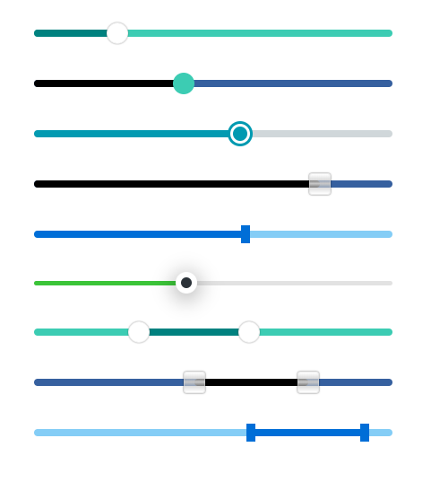
Responsive range slider library written in typescript and using web component technologies. Pure JavaScript without additional dependencies. It has a rich set of settings, including any number of pointers (knobs), vertical and horizontal slider, touch, mousewheel and keyboard support, local and session storage, range dragging, and RTL support. The functionality of the library can be extended using plugins. The library core is 27 KB minified or 9 KB compressed (GZip).
Links
Any Number of Pointers
The library supports any number of pointers (knobs/handles): one-pointer range slider, two-pointers range slider, or as many as you need.
Mobile Ready
Responsive and mobile-ready range slider that looks good on any devices 📱. It supports touch, mousewheel events, and keyboard.
Accessibility
It accessible via ARIA-attributes 🛡️

ES6 JavaScript & Typescript
The library is built with Typescript and does not use external dependencies 🔓. The core is 27KB minified or 9KB compressed (GZip).
Themes 🎨
The library has additional theme plugins with a ready-made set of styles such as gradients, glass, pointer shapes and more. It's also possible to develop your own theme as an external plugin.
Styles & Design
The library has multiple options for customizing 🔧 the appearance of the slider. Width, height, border radius, colors, hover and focus, and other properties can be customized using the slider attributes.
Images and SVGs can be used as pointers.
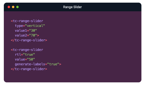
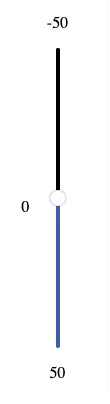
Direction & Orientation
The library supports horizontal and vertical orientation 🌐. It also supports left to right and right to left directions for a horizontal slider, and top to bottom and bottom to top for vertical sliders.
Numbers, Text, or Range
The slider range can be defined by a minimum and maximum numbers. Another option is to provide a list of individual (discrete) values. Both text ✍️ and numeric data are supported.

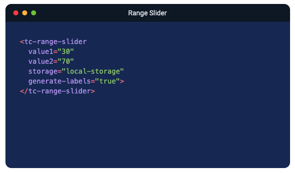
Local & Session Storage
Local storage 💾 and session storage support as a standalone plugin. The user selection will be saved and restored after page refresh or navigation from other pages.
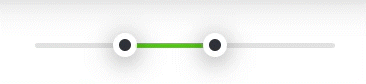
Moving Tooltip Plugin
Range slider library has a standalone Moving Tooltip Plugin. The plugin adds a moving tooltip to each pointer. You can change the tooltip color, size, and distance to pointer.

Other Features
- Based on web component technologies.
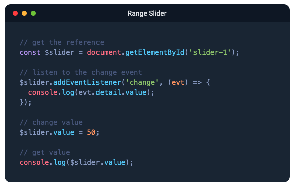
- Allows programmatic attribute changes 💻
- Simple dynamic rendering after ajax requests or delays.
- Disabled/enabled range slider (including API).
- Possibility to disable only one pointer.
- Non-linear range slider 📉
- Optional animation on panel click.
- Works well with Bootstrap and other CSS frameworks 👍
- No CSS conflicts due to web components.
- Automatically generated labels as a standalone plugin.
- Any number of sliders on one page.
- Supports two (and more) pointers overlap, pointers max and min distance.
- Supports range dragging.
- The functionality of the library can be extended using plugins.
- The range slide can be used in React and other frameworks.
- Extensive API based on TypeScript.
License
It can be used for free in any personal or commercial project 🎁