
Package Exports
- vue-data-ui
- vue-data-ui/style.css
Readme

vue-data-ui


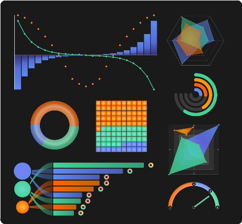
A user-empowering data visualization Vue components library.
Available components:
Charts
- VueUiAgePyramid
- VueUiCandlestick
- VueUiChestnut
- VueUiDonutEvolution
- VueUiDonut
- VueUiGalaxy
- VueUiGauge
- VueUiHeatmap
- VueUiMolecule
- VueUiMoodRadar
- VueUiNestedDonuts
- VueUiOnion
- VueUiQuadrant
- VueUiRadar
- VueUiRelationCircle
- VueUiRings
- VueUiScatter
- VueUiThermometer
- VueUiTiremarks
- VueUiVerticalBar
- VueUiWaffle
- VueUiWheel
- VueUiXy
Mini charts
3d
Tables
Rating
Utilities
- VueUiAnnotator
- VueUiDashboard
- VueUiDigits
- VueUiIcon
- VueUiKpi
- VueUiMiniLoader
- VueUiScreenshot
- VueUiSkeleton
Installation
npm i vue-data-uiYou can declare components globally in your main.js:
import { createApp } from 'vue'
import App from "./App.vue";
// Include the css;
import "vue-data-ui/style.css";

// You can declare Vue Data UI components globally
import { VueUiRadar } from "vue-data-ui";

const app = createApp(App);

app.component("VueUiRadar", VueUiRadar);
app.mount('#app');
Or you can import just what you need in your files:
<script setup>
  import { VueUiRadar, VueUiXy } from "vue-data-ui";
</script>
Since v.2.0.38, you can also use the "VueDataUi" universal component, just specifying which component you are using:
<script setup>
import { ref } from "vue";
import { VueDataUi } from "vue-data-ui";
// Include the css;
import "vue-data-ui/style.css";

const config = ref({...});
const dataset = ref([...]);

</script>

<template>

  <VueDataUi
    component="VueUiXy"
    :config="config"
    :dataset="dataset"
  />

</template>
Typescript
Types are available in the 'vue-data-ui.d.ts' file under the types directory of the package.
Nuxt
This repo contains a boilerplate implementation of the vue-data-ui package in Nuxt
Customizable tooltips
Charts with tooltips have a config option to customize tooltip contents:
customFormat: ({ seriesIndex, datapoint, series, config }) => {
  return `<div>${ ... }</div>`;
}
Slots
#svg slot
Most Vue Data UI chart components include a #svg slot you can use to introduce customized svg elements (shapes, text, etc).
<VueUiXy :dataset="dataset" :config="config">
  <template #svg="{ svg }">
    <foreignObject x="100" y="0" height="100" width="150">
      <div>
        This is a custom caption
      </div>
    </foreignObject>
  </template>
</VueUiXy>
The svg slot also works when using the VueDataUi universal component, if the component it wraps supports it.
#legend slot (since v.2.0.41)
All charts expose a #legend slot except for:
- VueUiWheel
- VueUiTiremarks
- VueUiHeatmap
- VueUiRelationCircle
- VueUiThermometer
- VueUiSparkline
- VueUiSparkbar
- VueUiSparkStackbar
- VueUiSparkgauge
- VueUiSparkHistogram
The legend slot also works when using the VueDataUi universal component, if the component it wraps supports it. It is recommended to set the show legend config attribute to false, to hide the default legend.
<VueUiDonut :config="config" :dataset="dataset">
  <template #legend="{ legend }">
    <div v-for="item in legend">
      {{ legend.name }}
    </div>
  </template>
</VueUiDonut>
Config
If for some reason you can't access the documentation website and need to get the default config object for a component:
import { getVueDataUiConfig } from "vue-data-ui";

const defaultConfigXy = getVueDataUiConfig("vue_ui_xy");