
Package Exports
- vue3-slider
This package does not declare an exports field, so the exports above have been automatically detected and optimized by JSPM instead. If any package subpath is missing, it is recommended to post an issue to the original package (vue3-slider) to support the "exports" field. If that is not possible, create a JSPM override to customize the exports field for this package.
Readme
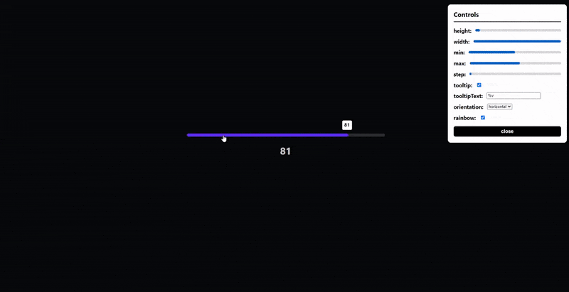
🔥 Vue 3 Slider 🔥 Become a Stargazer
Horizontal, vertical and circular sliders! Fully responsive, touch screen and keyboard control support!
Table of Contents 📰
Demo (Live Demo)
Installation
# with npm
npm install vue3-slider
# with yarn
yarn add vue3-sliderGetting Started 👍
Import component
import slider from "vue3-slider"

export default {
  ...
  components: {
    "vue3-slider": slider
  }
  ...
}
How to use
<vue3-slider v-model="myNumber" color="#FB278D" track-color="#FEFEFE" />Props
| Name | Type | Required | Default | Rules |
|---|---|---|---|---|
| v-model | Number | ✔️ | ||
| width | String | 100% | must be valid css length | |
| height | Number | 6 | ||
| color | String | #FB2727 | must be a valid hex, rgb, rgba or html color value | |
| trackColor | String | #F1F6F8 | ^^^ | |
| max | Number | 100 | cannot be less than min | |
| min | Number | 0 | cannot be greater than max | |
| step | Number | 1 | ||
| tooltip | Boolean | false | ||
| tooltipText | String | "%v" | must contain %v (%v is replaced with slider's value) | |
| tooltipColor | String | #FFFFFF | must be a valid hex, rgb, rgba or html color value | |
| tooltipTextColor | String | #000000 | ^^^ | |
| formatTooltip | Function | null | function must take one parameter (number) and return a string | |
| orientation | String | horizontal | restricted choice (horizontal, vertical, circular) | |
| repeat | Boolean | false | ||
| sticky | Boolean | false | ||
| flip | Boolean | false | ||
| circleOffset | Number | 0 | must be between 0 and 360 (inclusive) |
NOTE: When using the circular slider width is the diameter of the circle and height is the stroke width
NOTE: When using the circular slider it is advised to use absolute units for width to avoid issues
NOTE: circleOffset is calculated in degrees clockwise from the top of the circle (anti-clockwise with flip set to true)
Events
change
- Arguments:
(value: number) - Usage: The event is fired when the slider value changes
drag-start
- Arguments:
(value: number, event: MouseEvent | TouchEvent) - Usage: The event is fired when the user presses the slider
drag-end
- Arguments:
(value: number, event: MouseEvent | TouchEvent) - Usage: The event is fired when the user releases the slider
dragging
- Arguments:
(value: number, event: MouseEvent | TouchEvent) - Usage: The event is fired when the user drags the slider
License
Copyright © 2020 - Present, Freddie Nelson