
Package Exports
- daisyui
This package does not declare an exports field, so the exports above have been automatically detected and optimized by JSPM instead. If any package subpath is missing, it is recommended to post an issue to the original package (daisyui) to support the "exports" field. If that is not possible, create a JSPM override to customize the exports field for this package.
Readme
DaisyUI
It's like Tailwind CSS on steroids!
You have everything from Tailwind CSS, but you can also use component classes likebtn,card, etc...
🔗 Links
- 👉 [ See all components ]
- 📘 Documents: Netlify | Github
- 🎲 Try it online: Tailwind Play | Codepen
- 📦 Source: GitHub | NPM
- 📦 CDN: Unpkg | JSdeliver
🌼 Features
- Component classes: It adds component classes to Tailwind. Classes like
btn,card,... No need to deal with hundreds of utility classes. - Tailwind CSS plugin: DaisyUI is a Tailwind CSS plugin so you can simply add it to your
tailwind.config.jsfile. - Based on design system: DaisyUI applies design system concepts to Tailwind CSS. All components on your page are committed to a single design system.
- Customizable: You can customize the design of components with Tailwind utility classes and CSS variables.
- Semantic color names: Use color names like
primary,secondary,accent,... just like your design system defines. - RTL supported: Enable
rtlconfig for right to left layouts. - Themeable: Add multiple themes or change colors with a CSS variable. You can even set a theme for a specific section of your page.
- Designer-friendly: You can disable
styledconfig and only get the skeleton of components. No style, no colors. You can style everything using utility classes.
👩💻 Install now!
npm i daisyuiThen add DaisyUI to your tailwind.config.js
module.exports = {

  plugins: [
    require('daisyui'),
  ],

  // OPTIONAL: if you want to use DaisyUI colors everywhere
  theme: {
    extend: {
      colors: require('daisyui/colors'),
    },
  },

}
Or use a CDN
Loading CSS files from CDN is not recommended for production. It's better to install Tailwind and DaisyUI as Nodejs dependencies so you can config/customize everything, and purge unused styles.
- Full.css (Tailwind's default style + DaisyUI components)
https://unpkg.com/daisyui@0.8.x/dist/full.css - Default themes (optional)
https://unpkg.com/daisyui@0.8.x/dist/themes.css
🎉 Use
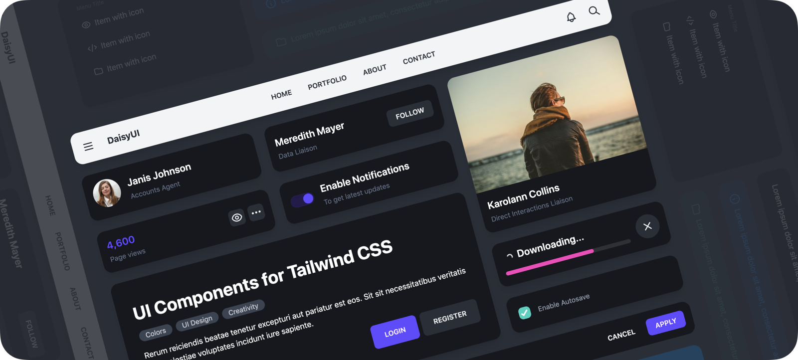
Use component classes like btn, card, etc... to build your UI.
<a class="btn">Hello!</a><div class="shadow card">
<div class="card-body">
<h2 class="card-title">Card Title</h2>
<p>Card text</p>
</div>
</div> 👉 See all components
🎲 Try it online
📘 Documents + Examples
Read the documents for more info
[ daisyui.netlify.app ↗︎ ]
List of components
- Accordion
- Alert
- Artboard
- App bar
- Avatar
- Avatar group
- Badge
- Banner
- Breadcrumb
- Button
- Button group
- Calendar
- Card
- Chat bubble
- Comment
- Countdown
- Divider
- Drawer
- Empty placeholder
- Footer
- Form
- Select
- Text input
- Text area
- Checkbox
- Radio
- Range slider
- Toggle
- Upload
- Hero
- Loading
- Menu
- Mockup
- Browser
- Code
- Phone
- Window
- Navbar
- Modal
- Pagination
- Progress
- Statistic
- Steps
- Tag
- Tabs
- Timeline
- Toast
- Tooltip
Please share
