
Package Exports
- daisyui
This package does not declare an exports field, so the exports above have been automatically detected and optimized by JSPM instead. If any package subpath is missing, it is recommended to post an issue to the original package (daisyui) to support the "exports" field. If that is not possible, create a JSPM override to customize the exports field for this package.
Readme
Tailwind CSS Components
Adds component classes like btn, card and more to Tailwind CSS

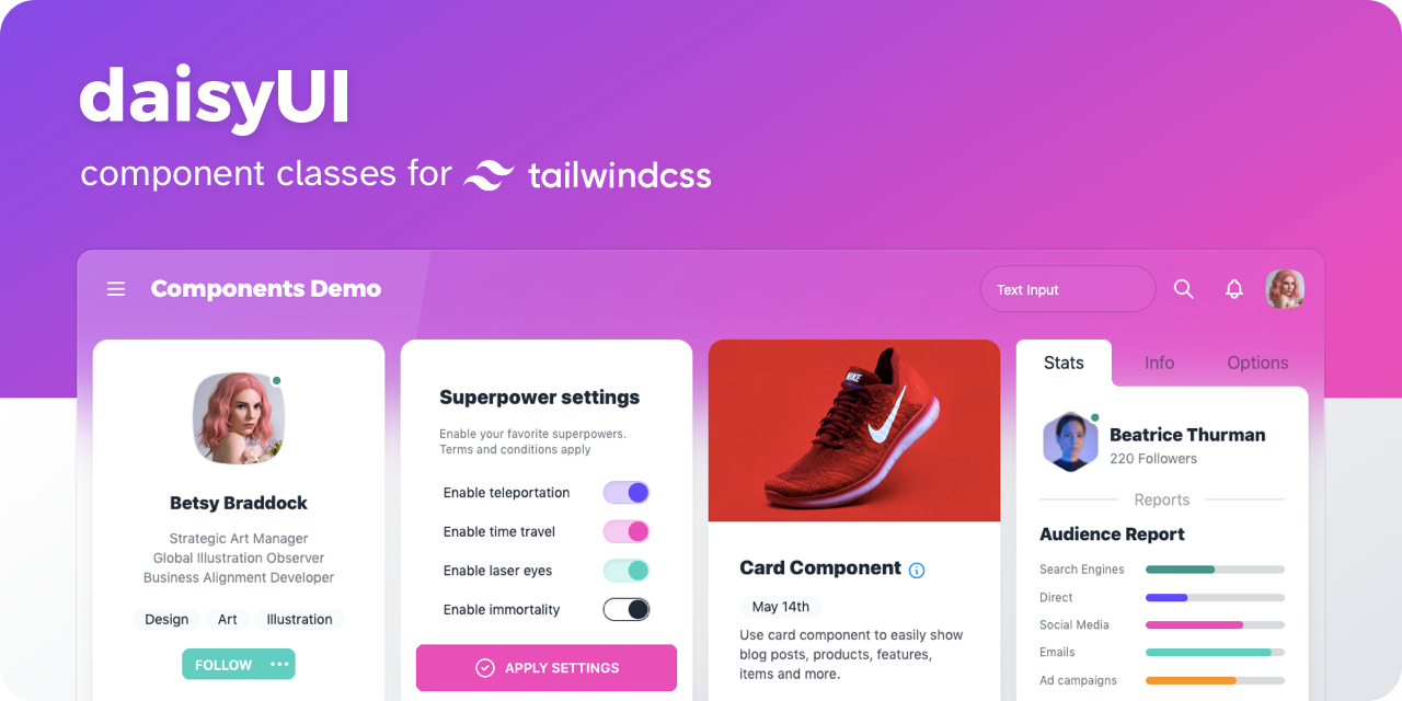
DaisyUI
- 👉 [ See all components ]
- 📘 Documents: daisyui.com
- 🎲 Try it online: Tailwind Play | Codepen
- 📦 Source: GitHub | NPM | Unpkg | JSdeliver
🌼 Features
- Tailwind CSS plugin
DaisyUI is a Tailwind CSS plugin. Install it, add it to yourtailwind.config.jsfile. - Component classes
Adds component classes to Tailwind. Classes likebtn,card,… So you will end up with a cleaner HTML. - Semantic color names
Adds color names likeprimary,secondary,accent,…. - Customizable
You can customize the design of components with Tailwind utility classes and CSS variables. - Themeable
Add multiple themes and customize colors. You can even set a theme for a specific section of your page. - RTL supported
Enablertlconfig for right to left layouts. - Pure CSS
No script file, no dependencies. 2KB gzip!
👩💻 Install now!
npm i daisyui --saveThen add DaisyUI to your tailwind.config.js
[ Read more ]
module.exports = {

  plugins: [
    require('daisyui'),
  ],

}
Or use a CDN
Loading CSS files from CDN is not recommended for production. It's better to install Tailwind and DaisyUI as Nodejs dependencies so you can config/customize everything, and purge unused styles.
<link href="https://cdn.jsdelivr.net/npm/tailwindcss@2.1/dist/tailwind.min.css" rel="stylesheet" type="text/css" />
<link href="https://cdn.jsdelivr.net/npm/daisyui@1.2/dist/full.css" rel="stylesheet" type="text/css" />🎉 Use
Use component classes like btn, card, etc… to build your UI.
<a class="btn">Hello!</a><div class="shadow card">
<div class="card-body">
<h2 class="card-title">Card Title</h2>
<p>Card text</p>
</div>
</div> 👉 See all components
🎲 Try it online
📘 Documents + Examples
Read the documents for more info
[ daisyui.com ↗︎ ]
List of components
- Alert
- Artboard
- App bar
- Avatar
- Avatar group
- Badge
- Banner
- Breadcrumb
- Button
- Button group
- Calendar
- Carousel
- Card
- Chat bubble
- Collapse (Accordion)
- Comment
- Countdown
- Cover
- Divider
- Drawer
- Empty placeholder
- Footer
- Form
- Select
- Text input
- Text area
- Checkbox
- Radio
- Range slider
- Rating
- Toggle
- Upload
- Hero
- Link
- Loading
- Menu
- Mockup
- Browser
- Code
- Phone
- Window
- Navbar
- Mask
- Modal
- Pagination
- Progress
- Stat
- Steps
- Tag
- Table
- Tabs
- Timeline
- Toast
- Tooltip
- Treeview
༼ つ ◕_◕ ༽つ Please share