
Package Exports
- react-hint
- react-hint/css/index.css
This package does not declare an exports field, so the exports above have been automatically detected and optimized by JSPM instead. If any package subpath is missing, it is recommended to post an issue to the original package (react-hint) to support the "exports" field. If that is not possible, create a JSPM override to customize the exports field for this package.
Readme
React-hint
React-hint is a small tooltip component for React which is developed with simplicity and performance in mind. It also plays nicely with Preact and Inferno. There is a demo page.

How to install
npm i -S react-hintHow to use
| Property/Attribute | Type | Default Value | Description |
|---|---|---|---|
| className | String | react-hint | <ReactHint /> is a singleton component. You can completely override the default tooltip style by passing className property with a new base class name. |
| data-rh | String or #element-id | To show a tooltip on any DOM element and its children add data-rh attribute with a tooltip text to the element. Pass #element-id instead of a text to show the element's HTML content. |
|
| data-rh-at | top, left, right, bottom | top | The default placement of a tooltip is at the top, but you can add data-rh-at attribute to change the placement. |
| data-rh-cls | String | To customize a single tooltip add data-rh-cls with a class name which will be added to the tooltip. |
import React from 'react'
import {render} from 'react-dom'
import ReactHint from 'react-hint'
import 'react-hint/css/index.css'
class Demo extends React.Component {
state = {count: 0}
componentDidMount() {
setInterval(() => {
this.setState({count: this.state.count + 1})
ReactHint.instance.forceUpdate()
}, 1000)
}
render() {
const {count} = this.state
return (
<div>
<button data-rh="Default">Default</button>
<button data-rh="Left" data-rh-at="left">Left</button>
<button data-rh="Top" data-rh-at="top">Top</button>
<button data-rh="Bottom" data-rh-at="bottom">Bottom</button>
<button data-rh="Right" data-rh-at="right">Right</button>
<button data-rh={`Count: ${count}`}>Count: {count}</button>
<button data-rh="#custom" data-rh-cls="react-hint--custom">Custom</button>
<ReactHint />
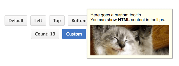
<div style={{display: 'none'}} id="custom">
Here goes a custom tooltip.<br />
You can show <b>HTML</b> content in tooltips.
<img src="//placekitten.com/260/100" />
</div>
</div>
)
}
}
render(<Demo />, document.getElementById('demo'))How to rerender
React-hint uses shouldComponentUpdate under the hood to decide if it needs to be updated. You can use ReactHint.instance.forceUpdate() in case you want to force an update.
License
MIT