
Package Exports
- react-hint
- react-hint/css/index.css
This package does not declare an exports field, so the exports above have been automatically detected and optimized by JSPM instead. If any package subpath is missing, it is recommended to post an issue to the original package (react-hint) to support the "exports" field. If that is not possible, create a JSPM override to customize the exports field for this package.
Readme
React-hint


React-hint is a small tooltip component for React which is developed with simplicity and performance in mind. It also plays nicely with Preact and Inferno.
How to install
npm i -S react-hintHow to use
// React
import React from 'react'
import ReactHintFactory from 'react-hint'
const ReactHint = ReactHintFactory(React)

// Preact
import {h, Component} from 'preact'
import ReactHintFactory from 'react-hint'
const ReactHint = ReactHintFactory({createElement: h, Component})

// Inferno
import Inferno from 'inferno-compat'
import ReactHintFactory from 'react-hint'
const ReactHint = ReactHintFactory(Inferno)

// UMD
const ReactHint = window.ReactHintFactory(window.React)
Options
| ReactHint Property | Type | Default Value | Description |
|---|---|---|---|
| attribute | String | "data-rh" | Allows setting a custom tooltip attribute instead of the default one. |
| autoPosition | Boolean | false | Autopositions tooltips based on closeness to window borders. |
| className | String | "react-hint" | You can override the tooltip style by passing the className property. |
| delay | Number | 0 | The default delay before showing/hiding the tooltip. |
| events | Boolean or {click: Boolean, focus: Boolean, hover: Boolean} | false | Enables/disables all events or a subset of events. |
| onRenderContent | Function | Passing a function which returns a react node allows rendering custom content with attached event handlers. | |
| persist | Boolean | false | Hide the tooltip only on outside click, hover, etc. |
| position | "top", "left", "right", "bottom" | "top" | Allows setting the default tooltip placement. |
| ref | Function | You can pass a function which will get a reference to the tooltip instance. |
| DOM Element Attribute | Type | Default Value | Description |
|---|---|---|---|
| data-rh | String | Sets the tooltip's content. | |
| data-rh-at | "top", "left", "right", "bottom" | "top" | Allows overriding the default tooltip placement. |
Example
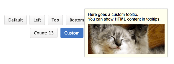
You don't need to include ReactHint in every component which uses tooltips, just include it once in the topmost container component. In case you need to define multiple instances of ReactHint, you can customise the attribute name per instance. ReactHint also supports custom tooltip content with attached event handlers by overriding the content renderer and returning a react node.
import React from 'react'
import {render} from 'react-dom'
import ReactHintFactory from 'react-hint'
import 'react-hint/css/index.css'

const ReactHint = ReactHintFactory(React)
class App extends React.Component {
    onRenderContent = (target, content) => {
        const {catId} = target.dataset
        const width = 240
        const url = `https://images.pexels.com/photos/${catId}/pexels-photo-${catId}.jpeg?w=${width}`

        return <div className="custom-hint__content">
            <img src={url} width={width} />
            <button ref={(ref) => ref && ref.focus()}
                onClick={() => this.instance.toggleHint()}>Ok</button>
        </div>
    }

    render() {
        return <div>
            <ReactHint autoPosition events delay={100} />
            <ReactHint persist
                attribute="data-custom"
                className="custom-hint"
                events={{click: true}}
                onRenderContent={this.onRenderContent}
                ref={(ref) => this.instance = ref} />

            <button data-rh="Default">Default</button>
            <button data-rh="Top" data-rh-at="top">Top</button>
            <button data-rh="Right" data-rh-at="right">Right</button>
            <button data-rh="Bottom" data-rh-at="bottom">Bottom</button>
            <button data-rh="Left" data-rh-at="left">Left</button>

            <button data-custom
                data-custom-at="bottom"
                data-cat-id="10913">Click Me</button>

            <button data-custom
                data-custom-at="bottom"
                data-cat-id="416088">Click Me</button>
        </div>
    }
}

render(<App />, demo)
License
MIT