
Package Exports
- react-native-tableview-simple
This package does not declare an exports field, so the exports above have been automatically detected and optimized by JSPM instead. If any package subpath is missing, it is recommended to post an issue to the original package (react-native-tableview-simple) to support the "exports" field. If that is not possible, create a JSPM override to customize the exports field for this package.
Readme
react-native-tableview-simple

NOTE: This component is WIP. Use it with caution!
This component is a copy of the iOS-TableView made with pure CSS. The intention is to provide a flexible and lightweight alternative to a bridged component.
The focus is set on the presentation. The component is therefore not intended to render large data sets.
A possible use case might be an about- or a settings-screen with a few rows.
Have a look at the Examples below! :-)
Installation
npm i react-native-tableview-simple --save- Add components
import {TableView, Section, Cell} from 'react-native-tableview-simple'
Extensible
This component provides you with some predefined CSS-styles, inspired by the native TableView.
You can always mix the Cell-instances inside a Section, with some Custom-Components.
Therefore the Cell-Component itself can't be manipulated. If you aren't satisfied with a component, feel free to create a PR or just create and use a custom component. Get inspired by the predefined cellstyles.
Submit a Cell-Component
Maybe you want to add your lovely designed Cell-Component to the project.
Just move your component to the folder components and choose a meaningful name! :-)
Props
TableView
Currently TableView doesn't provide any properties.
Section
| Prop | Default | Type | Description |
|---|---|---|---|
| header | - | string |
Header value |
| footer | - | string |
Footer value |
| sectionTintColor | #EFEFF4 | string |
Background color of section |
| headerTintColor | #6d6d72 | string |
Text color of header |
| footerTintColor | #6d6d72 | string |
Text color of footer |
| hideSeparator | false | bool |
Hide separators |
| separatorTintColor | #c8c7cc | string |
Color of separator |
| separatorInsetLeft | 15 | number |
Left inset of separator |
| separatorInsetRight | 0 | number |
Right inset of separator |
Cell
The cellstyles are inspired by the native ones. Just like the available accessories.
| Prop | Default | Type | Description |
|---|---|---|---|
| cellstyle | Basic | string |
Predefined styles: Basic, RightDetail, LeftDetail, Subtitle |
| title | - | string |
Title value |
| detail | - | string |
Detail value |
| cellTintColor | #fff | string |
Background color of cell |
| titleTintColor | #000 | string |
Text color of title |
| isDisabled | false | bool |
Cell is disabled. onPress will not get triggered |
| accessory | - | string |
Predefined accessory: DisclosureIndicator, Detail, DetailDisclosure, Checkmark |
| onPress | - | func or false |
If set, cell will be automaticaly initialized with TouchableHighlight |
| highlightActiveOpacity | 0.8 | number |
Opacity of cell when touch is active |
| hightlightUnderlayColor | 'black' | string |
Color of underlay that will show through when touch is active |
CustomCell
CustomCells allow you to define the whole content on your own.
This makes it possible to use components like ActivityIndicatorIOS or SwitchIOS as seen in the example below.
| Prop | Default | Type | Description |
|---|---|---|---|
| cellTintColor | #fff | string |
Background color of cell |
| isDisabled | false | bool |
Cell is disabled. onPress will not get triggered |
| onPress | - | func or false |
If set, cell will be automaticaly initialized with TouchableHighlight |
| highlightActiveOpacity | 0.8 | number |
Opacity of cell when touch is active |
| hightlightUnderlayColor | 'black' | string |
Color of underlay that will show through when touch is active |
Examples
The following examples can be found in the folder example.
To run the example project, follow these steps:
git clone https://github.com/Purii/react-native-tableview-simplecd examplenpm i- run
/example/ios/example.xcodeprojvia Xcode
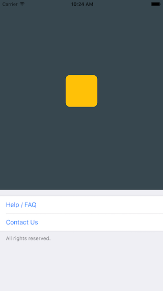
Use case: About-screen
import React, { AppRegistry, Component, PropTypes, StyleSheet, ScrollView, View, Text, ActivityIndicatorIOS, SwitchIOS } from 'react-native';
import {TableView, Section, Cell, CustomCell} from 'react-native-tableview-simple';
/**
* Sample React Native App
* https://github.com/facebook/react-native
*/
class Example extends Component {
render() {
return (
<ScrollView contentContainerStyle={styles.stage}>
<View style={{
backgroundColor: '#37474F',
height: 500,
alignItems: 'center',
justifyContent: 'center'
}}>
<View style={{
backgroundColor: '#ffc107',
width: 80,
height: 80,
borderRadius: 10
}}></View>
</View>
<TableView>
<Section footer="All rights reserved.">
<Cell title="Help / FAQ" titleTintColor="#007AFF" onPress={() => console.log('open Help/FAQ')}/>
<Cell title="Contact Us" titleTintColor="#007AFF" onPress={() => console.log('open Contact Us')}/>
</Section>
</TableView>
</ScrollView>
);
}
};
var styles = StyleSheet.create({
stage: {
backgroundColor: '#EFEFF4',
paddingBottom: 20,
flex: 1
},
});
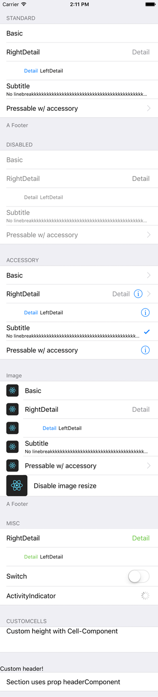
AppRegistry.registerComponent('example', () => Example);react-native-tableview-simple vs. Native iOS
The left screen is build using react-native-tableview-simple. The right one is native.
react-native-tableview-simple |
Native iOS |
|---|---|
 |
 |
import React, { AppRegistry, Component, PropTypes, StyleSheet, ScrollView, View, Text, ActivityIndicatorIOS, SwitchIOS } from 'react-native';
import {TableView, Section, Cell, CustomCell} from 'react-native-tableview-simple';

/**
 * Sample React Native App
 * https://github.com/facebook/react-native
 */

class Example extends Component {
  render() {
    return (
      <ScrollView contentContainerStyle={styles.stage}>
        <TableView>
          <Section header="STANDARD" footer="A Footer">
            <Cell cellstyle="Basic" title="Basic"/>
            <Cell cellstyle="RightDetail" title="RightDetail" detail="Detail" />
            <Cell cellstyle="LeftDetail" title="LeftDetail" detail="Detail"/>
            <Cell cellstyle="Subtitle" title="Subtitle" detail="No linebreakkkkkkkkkkkkkkkkkkkkkkkkkkkkkkkkkkkkkkkkkkkkkkkkkkkkkkkkkkkkkkkkkkkk"/>
            <Cell cellstyle="Basic" title="Pressable w/ accessory" accessory="DisclosureIndicator" onPress={() => console.log('Heyho!')}/>
          </Section>
          <Section header="DISABLED">
            <Cell cellstyle="Basic" isDisabled={true} title="Basic"/>
            <Cell cellstyle="RightDetail" isDisabled={true} title="RightDetail" detail="Detail" />
            <Cell cellstyle="LeftDetail" isDisabled={true} title="LeftDetail" detail="Detail"/>
            <Cell cellstyle="Subtitle" isDisabled={true} title="Subtitle" detail="No linebreakkkkkkkkkkkkkkkkkkkkkkkkkkkkkkkkkkkkkkkkkkkkkkkkkkkkkkkkkkkkkkkkkkkk"/>
            <Cell cellstyle="Basic" isDisabled={true} title="Pressable w/ accessory" accessory="DisclosureIndicator" onPress={() => {console.log('Heyho!')}}/>
          </Section>
          <Section header="ACCESSORY">
            <Cell cellstyle="Basic" accessory="DisclosureIndicator" title="Basic"/>
            <Cell cellstyle="RightDetail" accessory="DetailDisclosure" title="RightDetail" detail="Detail" />
            <Cell cellstyle="LeftDetail" accessory="Detail" title="LeftDetail" detail="Detail"/>
            <Cell cellstyle="Subtitle" accessory="Checkmark" title="Subtitle" detail="No linebreakkkkkkkkkkkkkkkkkkkkkkkkkkkkkkkkkkkkkkkkkkkkkkkkkkkkkkkkkkkkkkkkkkkk"/>
            <Cell cellstyle="Basic" accessory="Detail" title="Pressable w/ accessory" onPress={() => console.log('Heyho!')}/>
          </Section>
          <Section header="CUSTOMCELLS">
            <CustomCell>
              <Text style={{flex: 1, fontSize: 16}}>Loading</Text>
              <ActivityIndicatorIOS/>
            </CustomCell>
            <CustomCell>
              <Text style={{flex: 1, fontSize: 16}}>Switch</Text>
              <SwitchIOS/>
            </CustomCell>
          </Section>
        </TableView>
      </ScrollView>
    );
  }
};

var styles = StyleSheet.create({
  stage: {
    backgroundColor: '#EFEFF4',
    paddingTop: 20,
    paddingBottom: 20,
  },
});

AppRegistry.registerComponent('example', () => Example);